Starry is a design editor built around open formats and an AI that works directly on the canvas. You can open native Figma .fig files, describe a screen in plain language and watch Starry build real, editable layers, then export production code or script every operation headlessly.
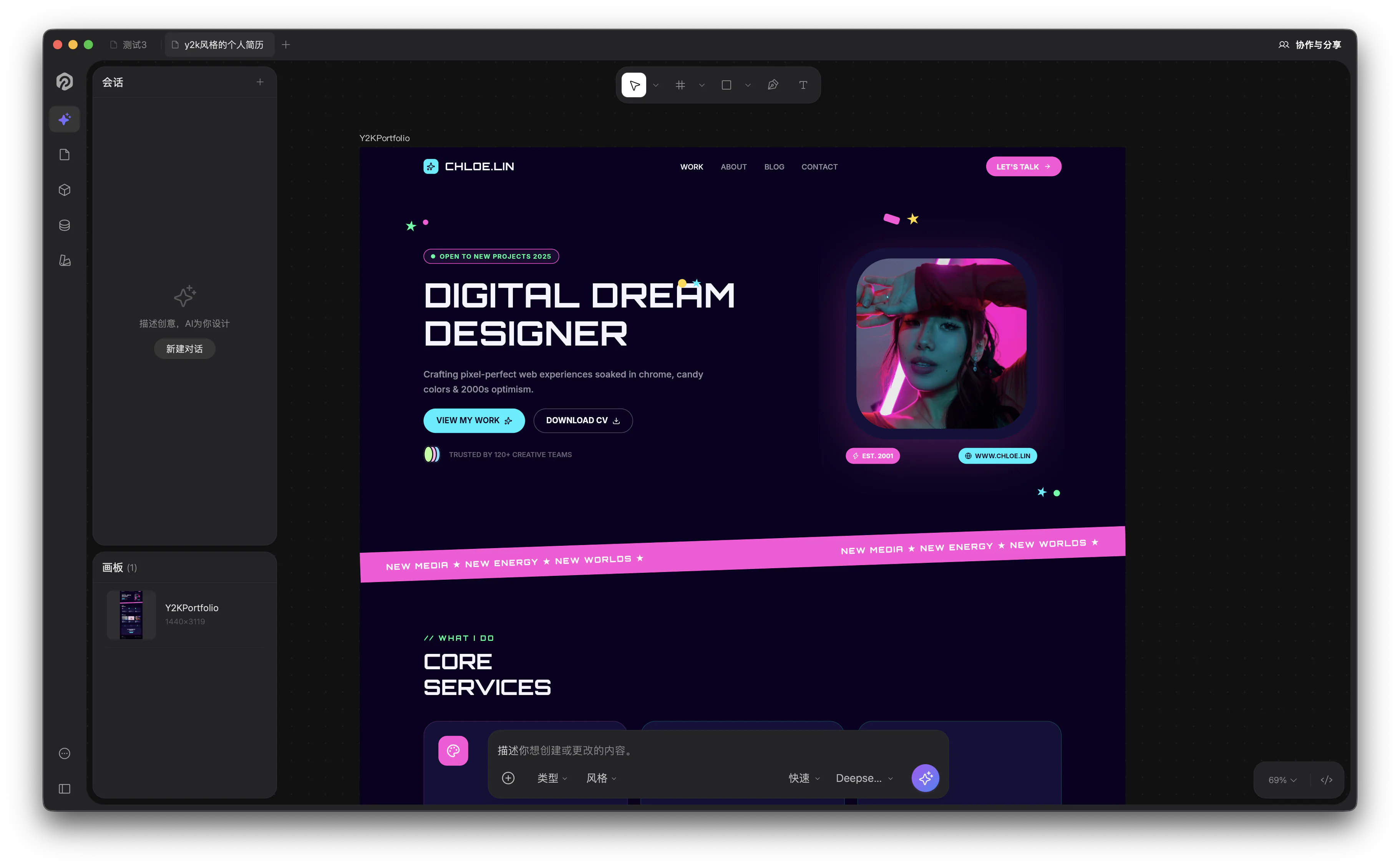
Designing a y2k portfolio in Starry — describe what you want in the bottom chat, the canvas updates in real time.
Why Starry
Open formats. Reads and writes native .fig and .pen files; copy & paste nodes between Starry and Figma.
AI builds and verifies. Describe what you want in chat; 100+ tools create and modify nodes, then Starry inspects the visual result before it finishes.
Design-to-code export. Turn any selection into JSX/Tailwind, HTML, SVG, or design tokens.
Fully programmable. A headless CLI, XPath queries, and an MCP server — every operation is scriptable.
Local-first & collaborative. Files are plain .pen documents on disk; real-time collaboration runs P2P over WebRTC with no server or account.
Components & auto-layout. Reusable components and variants, plus flex/CSS-grid auto-layout via Yoga.
Bring your own AI key. Starry connects to OpenRouter, Anthropic, OpenAI, Google AI, Z.ai, or MiniMax. No backend, no account — your prompts go straight to the provider you choose.
Who it's for
Designers who want to ship without handoff friction. Engineers who'd rather generate a screen than redraw it. Teams that need Figma-compatible editing with real programmatic access. If you live between "idea" and "running app," Starry is for you.
Getting Started
Install & open
Starry is a native desktop app built on Tauri v2 — for macOS, Windows, and Linux — and it also runs in the browser as a PWA. No account is required to start designing.
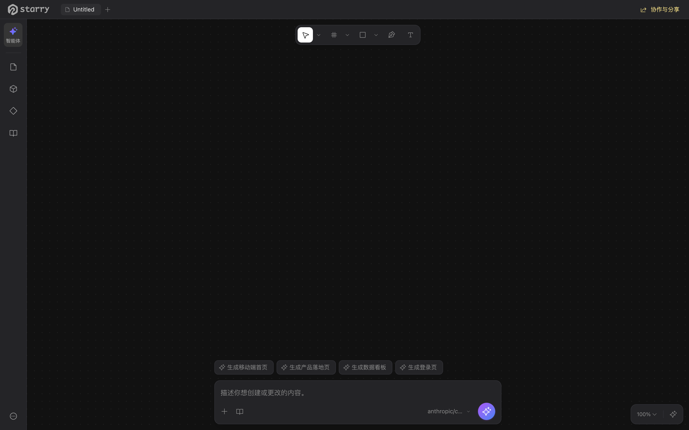
The Starry editor: describe what you want in the bottom input, navigate via the left sidebar, and edit on the canvas.
Desktop app
Pick whichever is easiest for your platform:
macOS — install with Homebrew:
brew install starryai
Any platform — download the latest installer from the Starry website. You'll find a .dmg / .app for macOS, an .msi for Windows, and .deb / .AppImage for Linux.
The app is a self-contained native binary; on macOS the installed .app is about 117 MB (size varies slightly by platform).
Private by default. Starry runs locally with no account, and your files never leave your machine unless you choose to share them.
Web app
Rather not install anything? Visit starry.design — the official site lets you start designing in your browser, no download required. Add it to your home screen for an app-like experience.
System requirements
macOS 12+, Windows 10+, or Linux
≈150 MB of free disk space
No GPU required; local design needs no internet (AI features need a provider key)
Open your first file
On first launch Starry creates a local workspace on your machine. Your designs are saved as .pen and .fig files — both are real, open design formats (it reads native Figma .fig files), and you can commit them to Git just like any source file.
Launch Starry (desktop) or open the web app.
Start from a blank canvas, or open a .pen / .fig file from inside the app or your OS file browser.
Ready to use AI? Add an API key for any provider — see the beginner's guide.
Getting Started
First secure launch (macOS)
The first time you open Starry on macOS, Gatekeeper may show a warning that Apple could not verify the app. The app is code-signed and safe to run. This guide shows how to approve it in a few clicks. You only do this once; later launches open normally.
Only download from the official source. Get Starry from starry.design — never install a package from anywhere else.
1 — Install and try to open
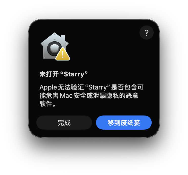
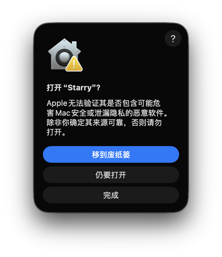
Download the .dmg from the Starry website and drag Starry into your Applications folder. Double-click it to open. You'll see a dialog: "Starry cannot be opened because Apple cannot verify Starry is free of malware." Do not click "Move to Trash" — just click "Done" (or close the dialog).
The first-launch Gatekeeper warning. Close it — we'll approve the app from System Settings instead.
2 — Open System Settings → Privacy & Security
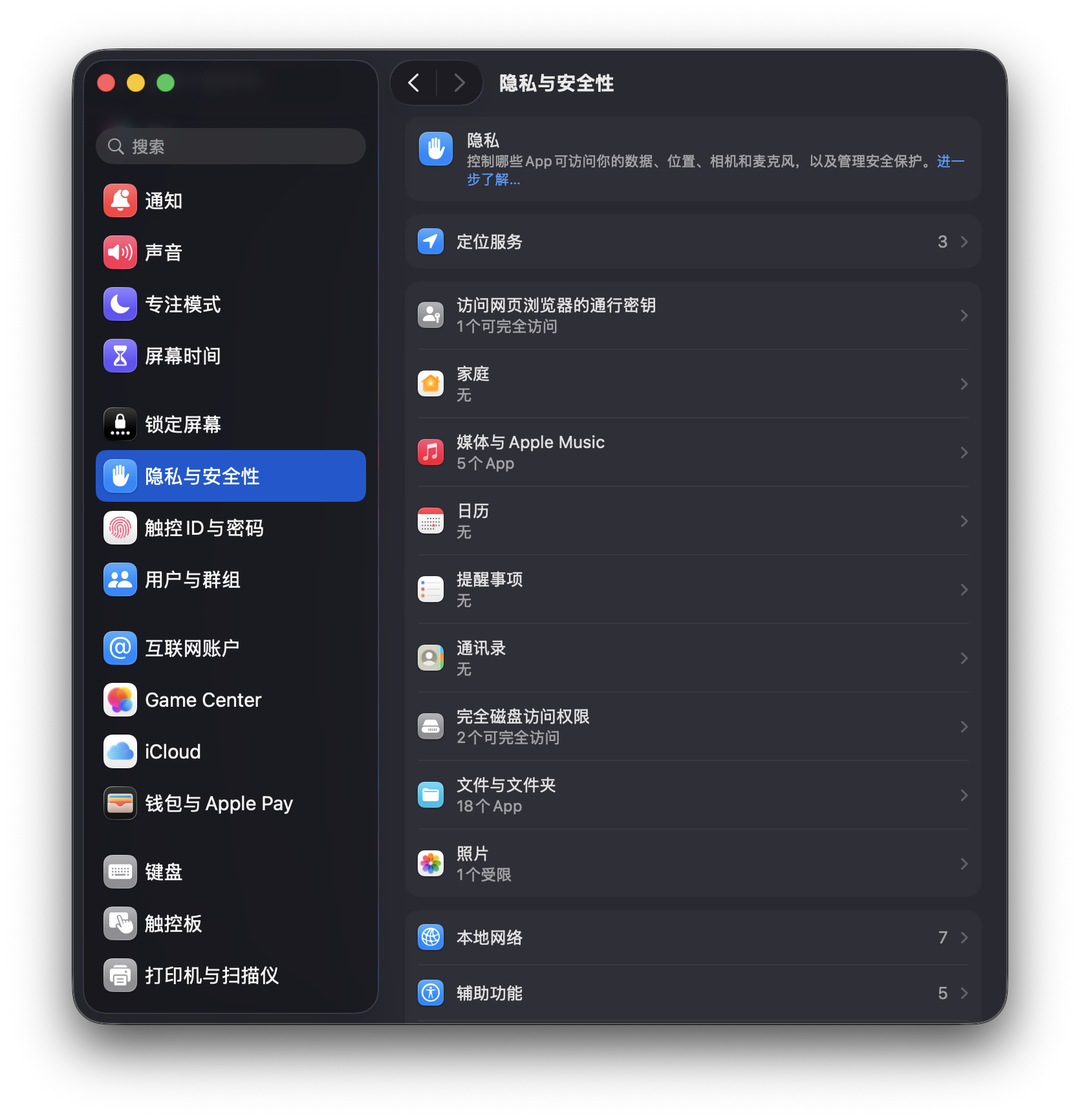
From the Apple menu, choose System Settings, then open Privacy & Security in the sidebar. Scroll down to the Security section at the bottom.
System Settings → Privacy & Security → the Security section at the bottom.
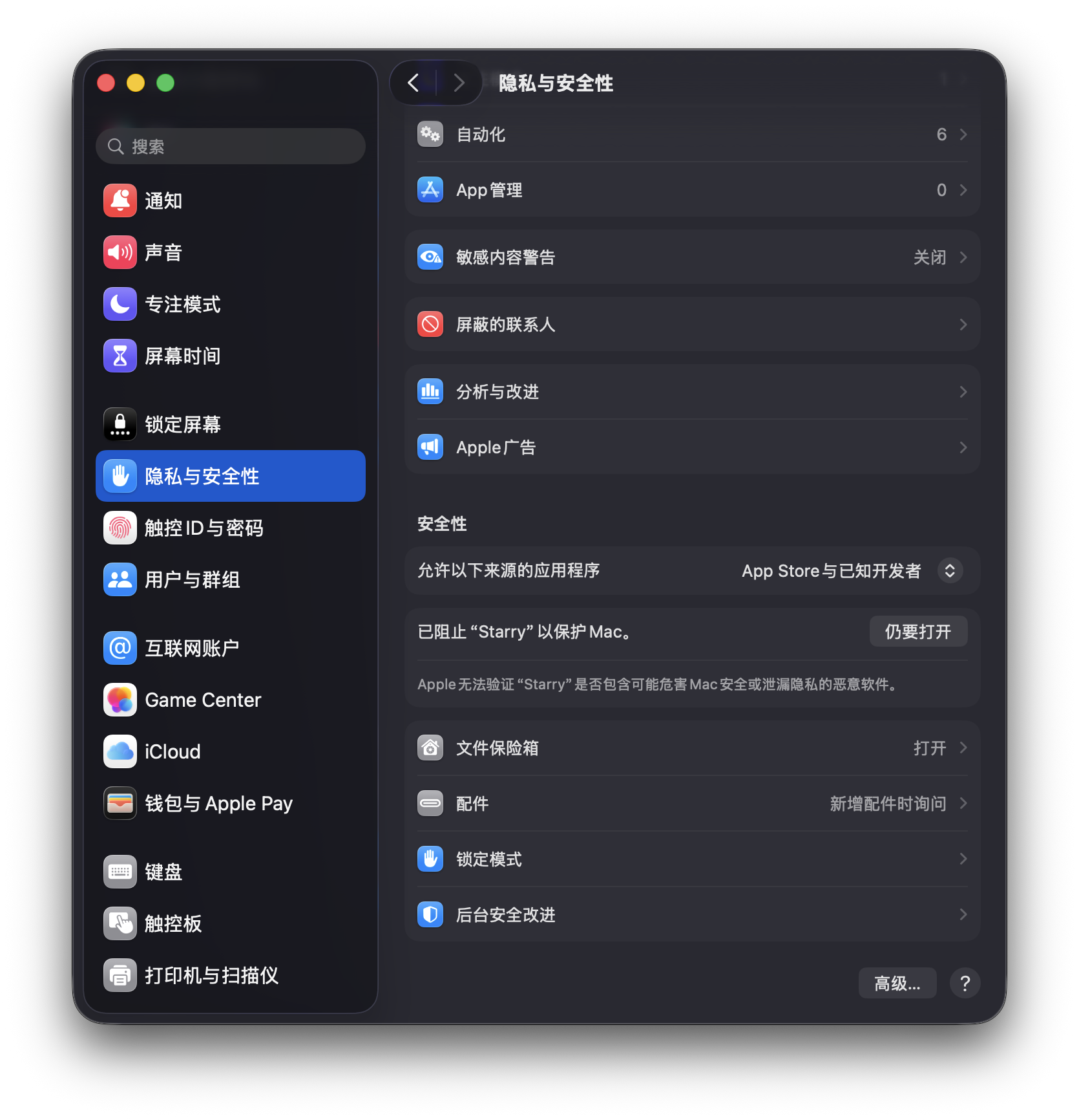
3 — Click "Open Anyway"
In the Security section you'll see a message: "Starry was blocked from opening because it is not from an identified developer." Click the Open Anyway button on the right.
The blocked-developer notice with the "Open Anyway" button.
4 — Confirm and launch
A final confirmation appears: "Apple could not verify Starry… Are you sure you want to open it?" Click Open Anyway again. Starry launches and is added to your list of allowed apps.
Confirm the launch — Starry opens and stays approved.
You're done — this is one-time only
After you approve it, Starry opens like any other Mac app and the warning never returns. If you ever erase or reinstall macOS, repeat these steps once.
Alternative: right-click to open
Instead of System Settings, you can Control-click (or right-click) Starry in Applications and choose Open from the menu. macOS shows the same confirm dialog with an Open button — click it and you're in.
Starry's AI features are provider-agnostic: the app talks directly to the LLM and image APIs you configure. Adding your own models and image-library keys is what turns Starry from a static canvas into a generative design tool. This guide shows how to set up both.
Your keys stay on your machine. Starry stores API keys locally and sends prompts straight to the provider. Nothing passes through Starry's servers.
Why configure models and assets?
Pick the right model for the job. Code-heavy screens benefit from strong reasoning models; quick explorations can use faster, cheaper models.
Bring your own rate limits and pricing. You control which provider account is billed and which regions the request hits.
Use real images, not placeholders. With a stock-photo key, AI-generated screens can pull actual photos instead of gray boxes.
1 — Add a model
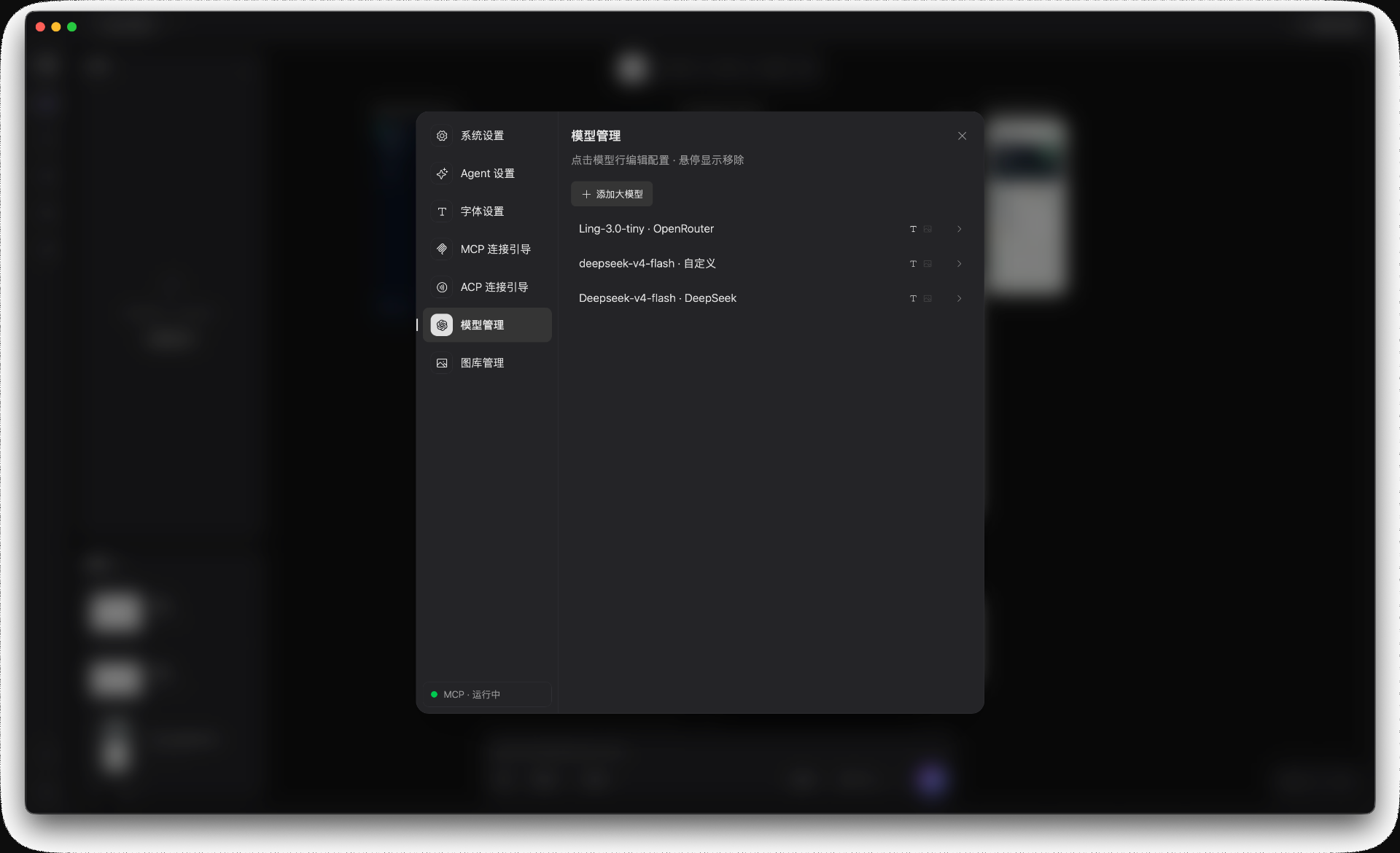
Open Settings from the app menu, then choose 模型管理. You'll see the list of currently configured models.
The model list. Hover a row to remove it; click a row to edit the configuration.
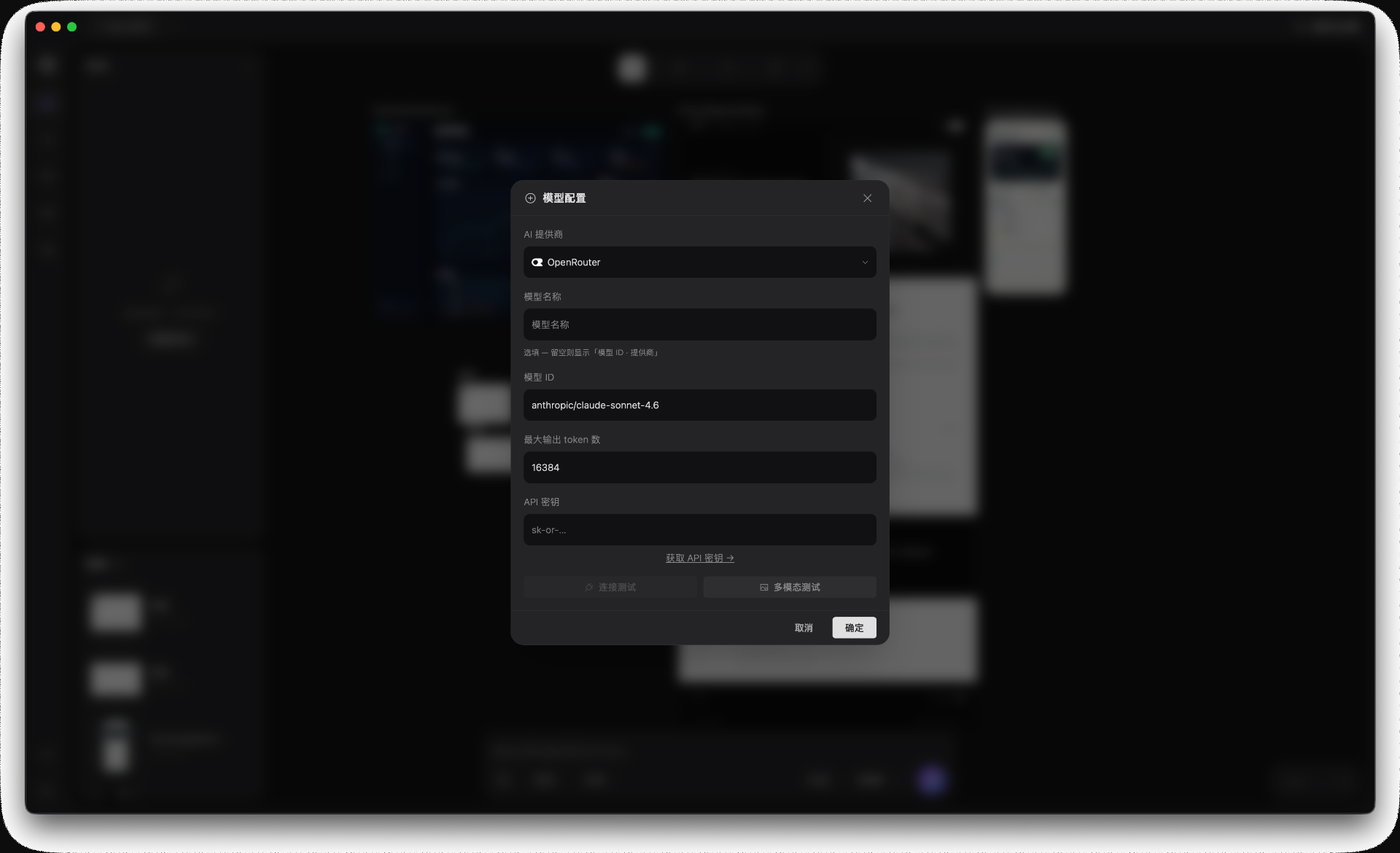
Click 添加大模型. In the configuration dialog:
Provider — choose the built-in adapter (OpenRouter, DeepSeek, etc.) or a custom endpoint.
Model name — the display label you see in Starry.
Model ID — the provider's internal ID, e.g. anthropic/claude-sonnet-4.6. Starry uses this when calling the API.
Max output tokens — caps the response length for cost control.
API key — your personal key for that provider.
Fill in the provider, model ID, max tokens, and API key. Starry saves the key locally.
Click 确定 to save. The model appears in the list and is available in the AI chat right away.
Using other providers or a custom endpoint
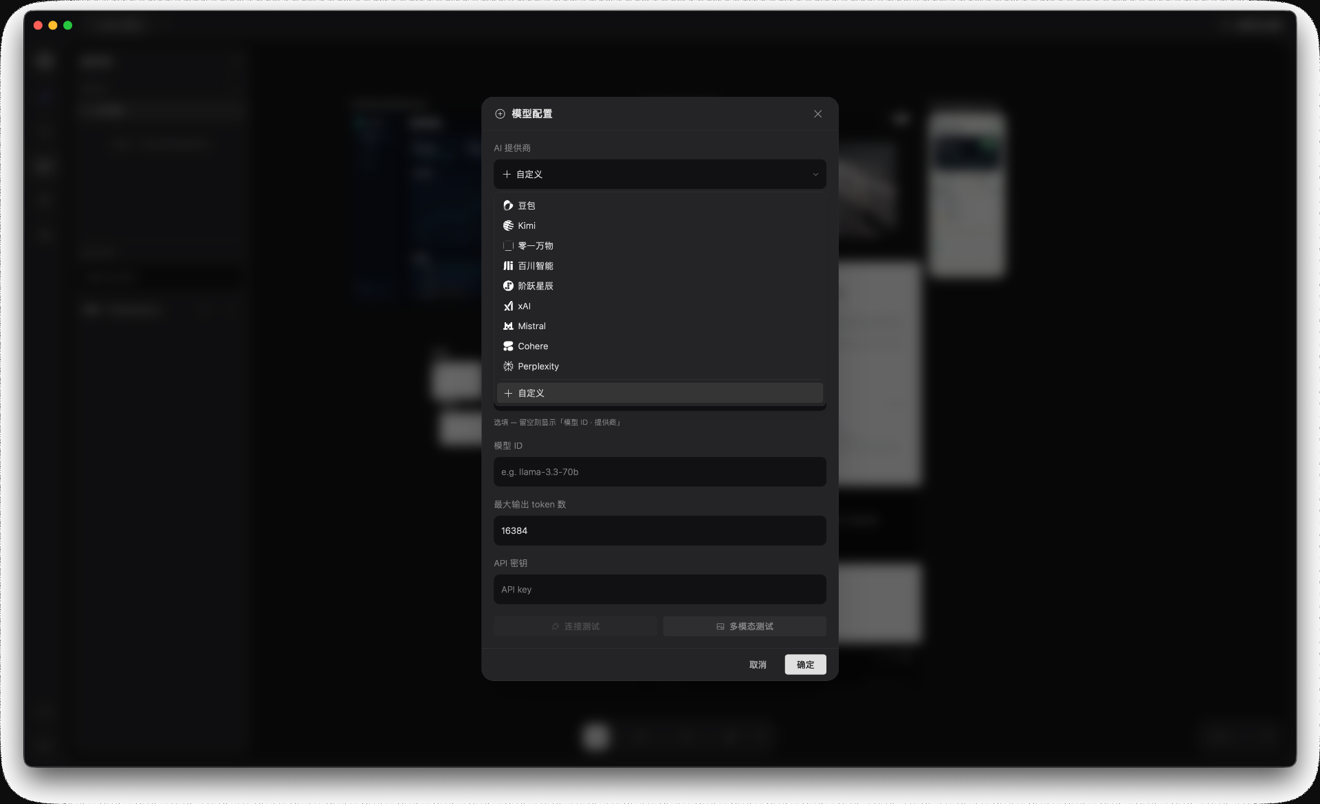
The provider dropdown includes both global services and Chinese LLM platforms: Doubao, Kimi, 01.AI, Baichuan, Stepfun, xAI, Mistral, Cohere, Perplexity, and others. If your provider is not listed, choose 自定义 (Custom).
The provider list covers major global and Chinese LLM services, plus a custom option at the bottom.
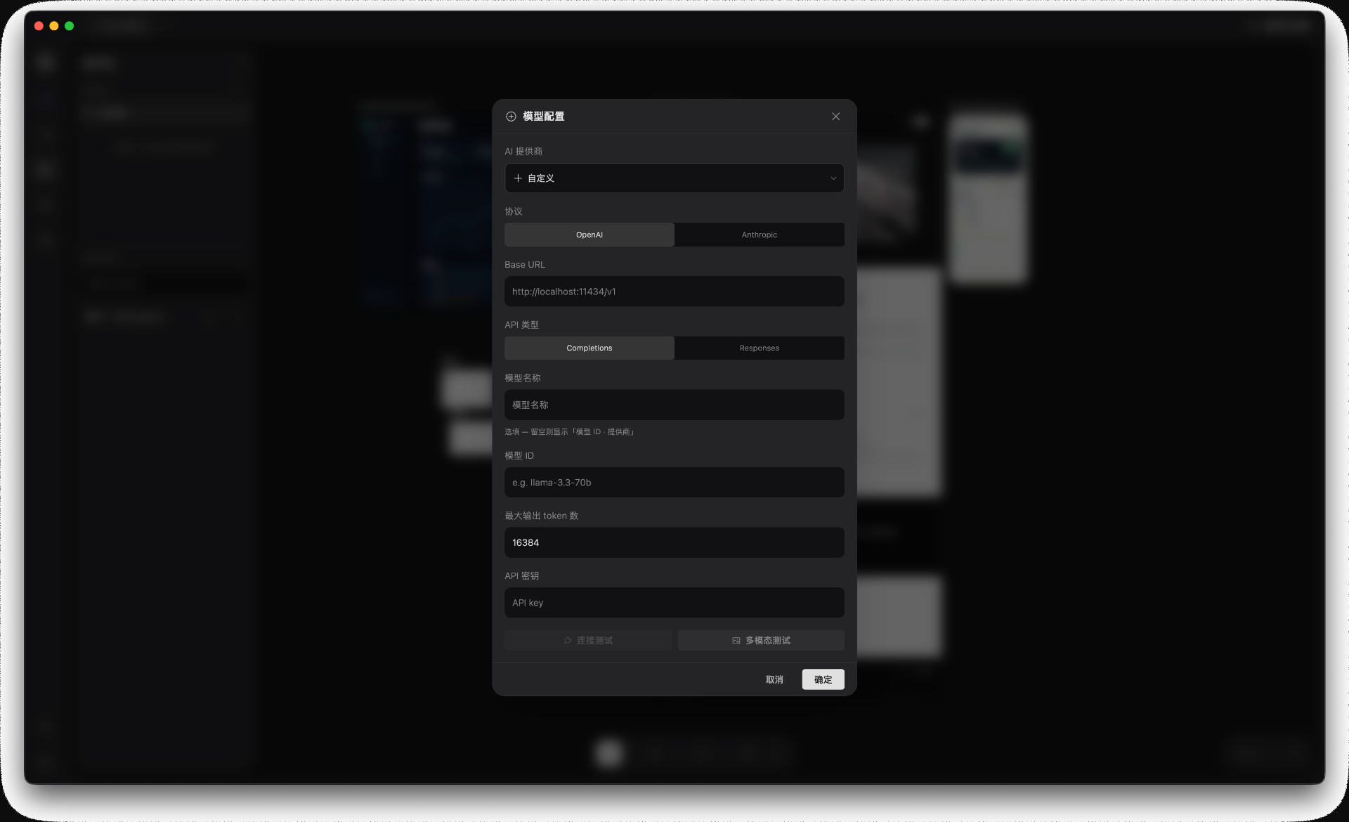
When you select 自定义, Starry asks for the protocol details:
Protocol — OpenAI or Anthropic format. Pick the one your endpoint speaks.
Base URL — your own API base, e.g. http://localhost:11434/v1 for a local Ollama server, or a private deployment.
API type — Completions or Responses, depending on what the endpoint supports.
Model name / Model ID / Max tokens / API key — same as built-in providers.
Custom provider mode. Set the protocol, base URL, API type, and your key to connect a private or local model.
This lets you connect local models (Ollama, vLLM), private company deployments, or new providers Starry has not shipped an adapter for yet.
2 — Add an image library
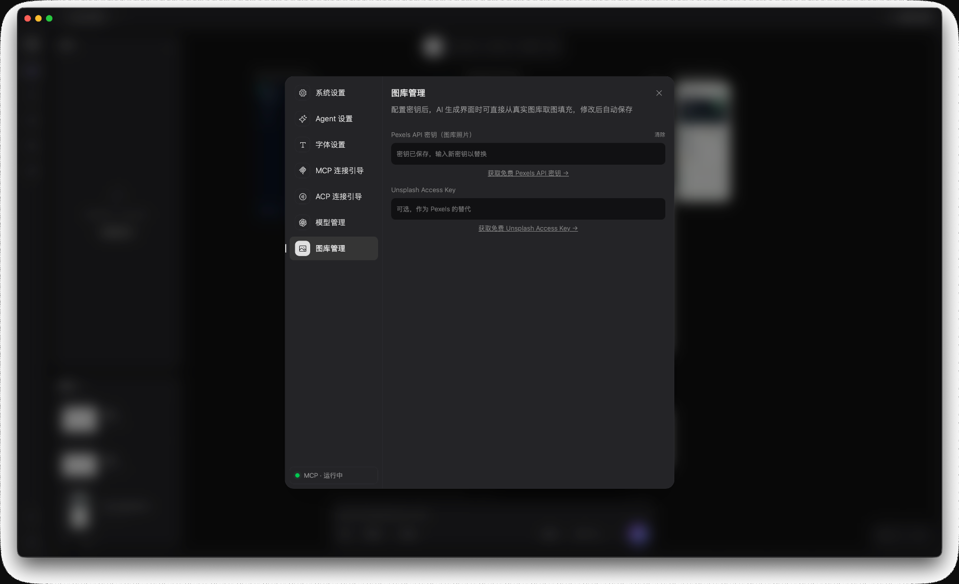
Go to Settings → 图库管理. This is where you add keys for stock-photo services so AI-generated screens can fetch real images.
The image-library panel. Pexels is the primary source; Unsplash can be configured as a fallback.
Pexels API key — required for photo search. Get a free key from pexels.com/api and paste it here.
Unsplash Access Key — optional fallback. Register at unsplash.com/developers if you want a second source.
Changes are saved automatically. The next time you ask the AI to generate a screen with images, Starry will search the configured libraries and use real photos.
You're ready to generate
With at least one model and an image key configured, you can describe a screen in the AI chat and Starry will build it using real providers and real assets. See the Quick start for the first prompt.
Getting Started
Quick start
From a blank canvas to a working screen in a few minutes. This walks the core loop: describe, review, refine.
1. Open the AI chat
When you open Starry, the AI chat is already there — use the input box at the bottom of the canvas, or click the sparkle (agent) icon at the top of the left rail. The first time, add an API key for any provider — OpenRouter, Anthropic, OpenAI, Google AI, Z.ai, or MiniMax.
2. Describe a screen
Tell Starry what to build. Be specific about the screen's purpose and the pieces it should contain.
The chat input at the bottom of the canvas: type a prompt, choose a model, and send.
Write a welcome letter from Starry — a centered
card with a headline, a short paragraph, and a
green "Continue" button at the bottom.
3. Review the canvas
Starry creates the frames and lays them out with auto-layout, then names the layers. Select anything and ask for a change.
4. Export or keep iterating
Happy with it? Export to code. Want changes? Just keep talking — the canvas and the code stay in sync.
Tip: short, iterative prompts beat one giant spec. Generate a skeleton, then refine section by section.
Getting Started
Beginner's guide
This guide walks you from a fresh install to your first AI-generated screen, one step at a time. The one thing you must do before Starry's AI works is connect a model — so we spend the most time on that.
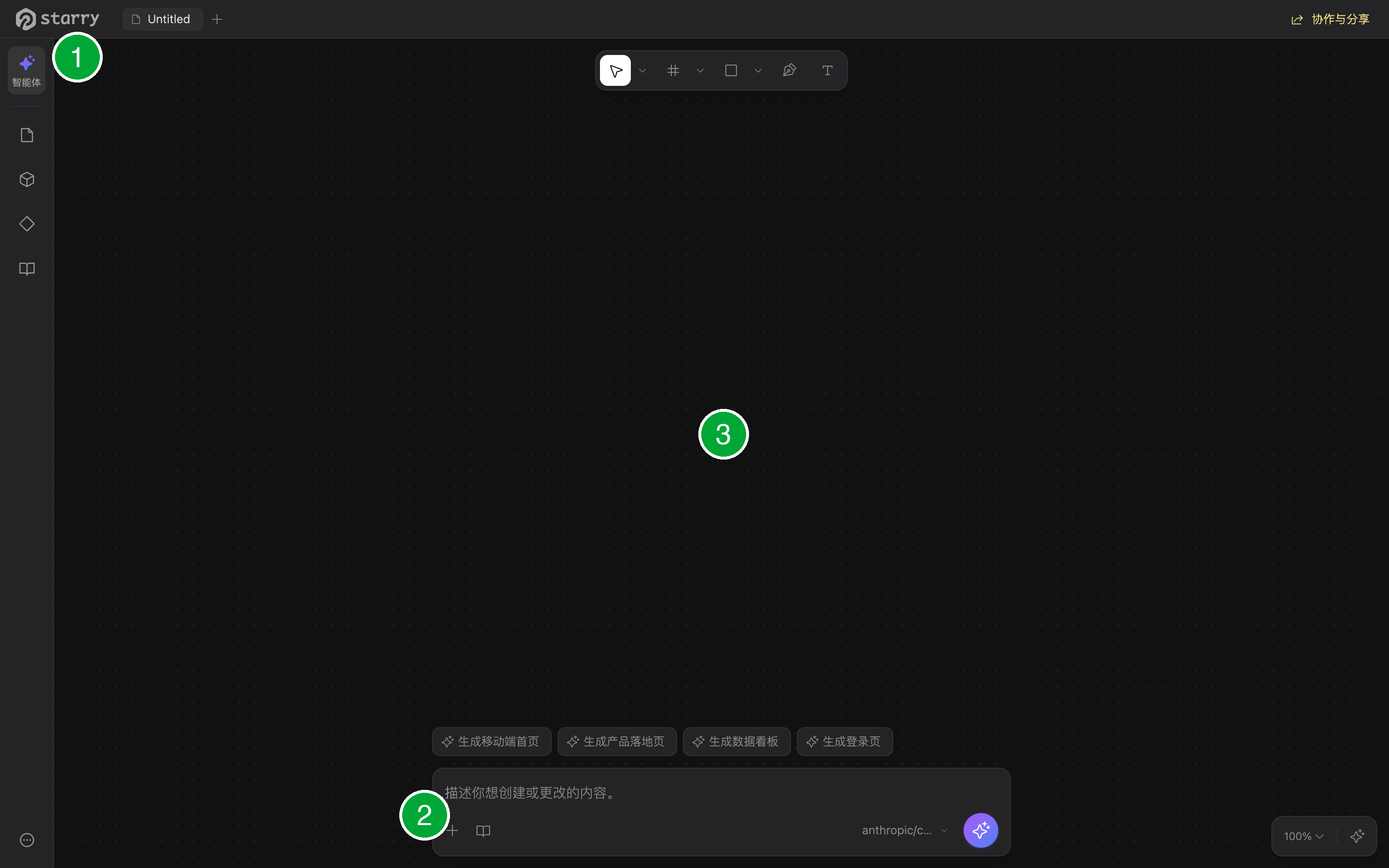
1 — Agent entry in the left rail: open the chat (Step 2) · 2 — bottom input: describe what to build (Step 3) · 3 — the canvas where Starry renders the result.
An API key from any supported AI provider. Starry has no backend and no account, so you bring the key and your prompts go straight to the provider you choose.
No key, no AI — but the editor still works. You can open, edit, and export .fig / .pen files without any key. The key only unlocks the chat assistant.
Step 1 — Download & open
Starry runs as a desktop app or right in your browser — no sign-up needed. Download the installer for your system (macOS / Windows / Linux) and open it, or just open the web app. Find the links in Install & open.
Launch Starry and open a blank canvas (or a .pen file). You're ready to set up the AI.
Step 2 — Connect a model (add your API key)
This is the only setup step the AI needs. Starry supports many providers — pick one you already have a key for, or create a free one.
Supported providers
OpenRouter — a single key unlocks hundreds of models (Claude, GPT, Gemini, DeepSeek, Qwen, Kimi…). Great for trying many models from one place.
Anthropic (Claude), OpenAI (GPT), Google AI (Gemini), DeepSeek, Z.ai (GLM), MiniMax.
Any OpenAI-compatible endpoint — 通义千问, 豆包, Kimi, 零一万物, 百川, 阶跃星辰, and more. Just paste the provider's base URL.
Add your key
Open the chat: click the sparkle (agent) icon at the top of the left rail, or use the input box at the bottom of the canvas.
Add your API key for the provider you want. If you don't have one yet, grab it from that provider's console — links are in the table below.
Once the key is saved, the chat is ready. Starry calls the provider directly from your device; the key never leaves your machine.
Where do I get a key? Every provider has an "API keys" page in its console. A quick-reference table is just below. Keys never leave your device.
Send a test message in the chat — for example "hello". If the model replies, you're connected.
Step 3 — Write your first design
With a model connected, just type in the chat what you want in plain language. Starry builds real, editable layers with auto-layout. For example, type:
Write a welcome letter from Starry — a centered card with a headline, a short paragraph, and a green "Continue" button at the bottom.
Starry generates the frames, names the layers, and applies auto-layout. Select anything and keep refining in natural language — "make the button bigger", "add a subtitle above the title".
Step 4 — Export to code
Happy with it? Starry turns any selection into clean, handoff-ready code — JSX styled with Tailwind, or plain HTML — that you can drop straight into your project with no lock-in. For every export option, see Exporting code.
Step 5 — (Optional) connect your editor
Want AI in your codebase? Add Starry's MCP server to Claude Code, Cursor, or any MCP client. See MCP & editor tools.
Speed up your day-to-day work in Starry. ⌘ is the Command key on macOS; on Windows/Linux it's Ctrl.
Tools
Shortcut
Tool
V
Select
K
Scale
FA
Frame
S
Section
R
Rectangle
O
Ellipse
L
Line
T
Text
P
Pen
H
Hand
Files
Shortcut
Action
⌘S
Save
⌘⇧S
Save as
⌘O
Open file
⌘⇧I
Import
⌘⇧E
Export the selection as PNG
⌘N/⌘T
New tab
⌘W
Close tab
Editing
Shortcut
Action
⌘Z
Undo
⌘⇧Z/⌘Y
Redo
⌘A
Select all
⌘D
Duplicate
Backspace/Delete
Delete
⌥Delete
Delete, bypassing confirmation
⌘G
Group
⌘⇧G
Ungroup
⌘⌥G
Frame selection
⌘⌥K
Create component
⌘⇧K
Create component set
⌘⌥B
Detach instance
⌘⇧H
Toggle visibility
⌘⇧L
Toggle lock
]/[
Bring to front / Send to back
⇧H
Flip horizontal
⇧V
Flip vertical
⌥⇧U
Boolean union
⌥⇧S
Subtract
⌥⇧I
Intersect
⌥⇧E
Exclude
⌥⇧F
Flatten
Enter
Confirm or enter text
Escape
Deselect / exit
Canvas
Shortcut
Action
⌘=
Zoom in
⌘-
Zoom out
⌘0
Zoom to 100%
⌘1
Fit view
⌘2
Zoom to selection
⌘⇧C
Eyedropper (pick a screen color)
⌘\
Toggle the UI chrome
⇧A
Toggle auto-layout on the selection
Every menu action also shows its shortcut next to it — in the Edit menu or the right-click menu. Actions without a shortcut here live there.
Guides
Writing effective prompts
Starry treats your prompt as the source of truth for the interface. The AI works directly on the canvas — 100+ tools create shapes, set fills and strokes, manage auto-layout, build components and variables, run boolean operations, and export assets — so a good prompt is the difference between a rough sketch and a handoff-ready screen.
The chat input at the bottom of the canvas: type a prompt, choose a model, and send.
Prompts that work
Describe the interface the way you'd brief a designer. Three things make a prompt click:
Name the screen and its goal."A mobile login screen", "a SaaS pricing page" — what it is and what it's for.
List the key components. Inputs, buttons, cards, nav — the building blocks you expect to see.
State the layout intent. Columns, centered, sidebar, grid — how the blocks should sit.
Go further when it matters:
Give scale clues."Top nav 1440 wide, dark" or "2×2 card grid" — rough dimensions keep proportions sane.
Describe images, don't name them. For photo placeholders, use an English search query the library understands: "aerial city skyline sunset", not "image1". Hint the orientation too — landscape (default), portrait, or square.
Short and iterative beats long and one-shot. Generate a skeleton first, then refine section by section.
How Starry builds
Under the hood, Starry works in four phases — it's worth knowing so nothing looks like a glitch:
Plan — a quick text outline of the blocks, dimensions, and layout approach.
Skeleton — the whole page appears as gray placeholder blocks, like a wireframe with correct proportions.
Fill — each skeleton section is replaced, one by one, with the real content.
Polish — photo placeholders are filled from the stock library (see Stock photo keys), and Starry verifies the result.
After generating, Starry runs a built-in check for layout, accessibility, and design-system issues, and fixes the meaningful ones before showing the summary — so you get a working screen, not a pile of overlaps.
Iterating in natural language
Select any node and ask for a change — "make this button green", "add a subtitle above the title". Starry edits the real layer, not a redraw. You can also select several nodes and ask to rearrange, re-layout, or restyle them: the selection is treated as source material — its content is kept, while Starry is free to resize, crop, recolor, and recompose it into a new layout.
Components & variants
As you build, Starry assembles reusable components and groups variants into component sets. Switch variants from the inspector; later exports keep those tokens, so your code stays consistent.
AI, not magic. Starry generates editable structure you own, and checks its own work — but review the layers the way you would a teammate's pull request.
Design & editing
Auto layout & CSS Grid
Auto layout is Starry's flexbox engine, powered by Yoga WASM — the same layout model React Native uses. Turn it on for a container and its children arrange themselves: add, remove, or resize content and the layout flows, no manual nudging.
Turn it on
Select a frame, then in the inspector's Layout section toggle Auto layout (or press ⇧A). Choose a layout mode: Horizontal (row), Vertical (column), Wrap, or Grid. To wrap loose selections into a layout frame, select them and press ⌘⌥G.
Spacing & alignment
Gap — spacing between children along the main axis.
Padding — space inside the container around its children.
Justify — alignment along the main axis: start, center, end, or between.
Items — alignment across the cross axis: start, center, end, or stretch.
Sizing
Hug — the container shrinks to fit its children.
Fill — a child stretches to fill its parent (requires the parent to use auto layout).
Grow — a child expands to share remaining space among siblings.
A fill child needs a fill-capable chain: nested auto-layout containers must set fill at every level to stretch. And hug/fill can't be circular — at least one child needs a concrete size.
Wrap
In Wrap mode, children flow onto new lines when they run out of room. Always set a row gap when wrapping, or the rows will touch.
CSS Grid
In Grid mode you define tracks instead of a single axis: set columns and rows (e.g. 1fr 1fr or 200px 1fr), column and row gaps, and place children explicitly with column start / row start / column span / row span.
Stay on a grid
Stick to a 4px spacing grid (4, 8, 12, 16, 24, 32, 48) for consistency. Inside a group less than between groups, which is less than between sections — and padding should be at least as large as the gap in the same container.
AI builds it too. When Starry generates a screen it uses auto layout throughout — flex rows and columns, fill, gap — so the result is fluid and responsive, not a stack of fixed rectangles.
Guides
Exporting code
Designs are never stranded. Turn any artboard into clean, handoff-ready code with pixel-perfect parity to the canvas — from the editor, the CLI, or an AI coding tool.
Supported outputs
JSX — React components, in two styles: tailwind (Tailwind utility classes) or starryai (the editor's own compact prop syntax).
HTML — standalone markup, ready to drop anywhere.
SVG — vector output of any selection.
.fig — native Figma file, for round-tripping with Figma.
Design tokens — your variable collections emitted as CSS variables, one value set per mode (light, dark…).
PNG / JPG / WEBP — raster exports with scale and quality control.
Export from the editor
Select the nodes you want, then use Copy as in the code menu:
JSX — selection as React JSX, straight to the clipboard.
SVG — vector markup of the selection.
CSS — a complete stylesheet: layout, fills, border radius, strokes, opacity, shadows and blur, rotation, blend modes, auto-layout, and typography.
JSON — the raw node structure.
Node ID — handy for scripting and MCP calls.
Layout, spacing, and style tokens transfer exactly as designed.
Options: -o/--output output path (default <name>.<format>, bitmaps get @<scale>x), -s/--scale (default 1), -q/--quality 0–100 for JPG/WEBP (default 90), --page <name> to export a specific page (default: first), --node <id> to export a single node (mutually exclusive with --page), and --style starryai|tailwind for JSX (default starryai).
Design tokens
Your variables become real CSS custom properties. Starry walks every variable collection, resolves aliases, and emits one value per mode — so a light/dark collection yields a token block per mode. Components map out alongside, keeping the same names you see in the canvas.
Export with AI tools
The same exporters are exposed as MCP tools (get_jsx, export_svg, export_image, export_pdf, diff_jsx), so Claude Code, Cursor, or Starry's own chat can read a design and produce code. The code-to-design path is also exact: JSX exports use the same syntax as the render tool, so exported JSX can be rendered back onto the canvas.
Run the CLI in CI to batch-export assets, lint for typography violations, and diff design changes automatically during code review. The output is yours — no lock-in.
Guides
Import from Figma
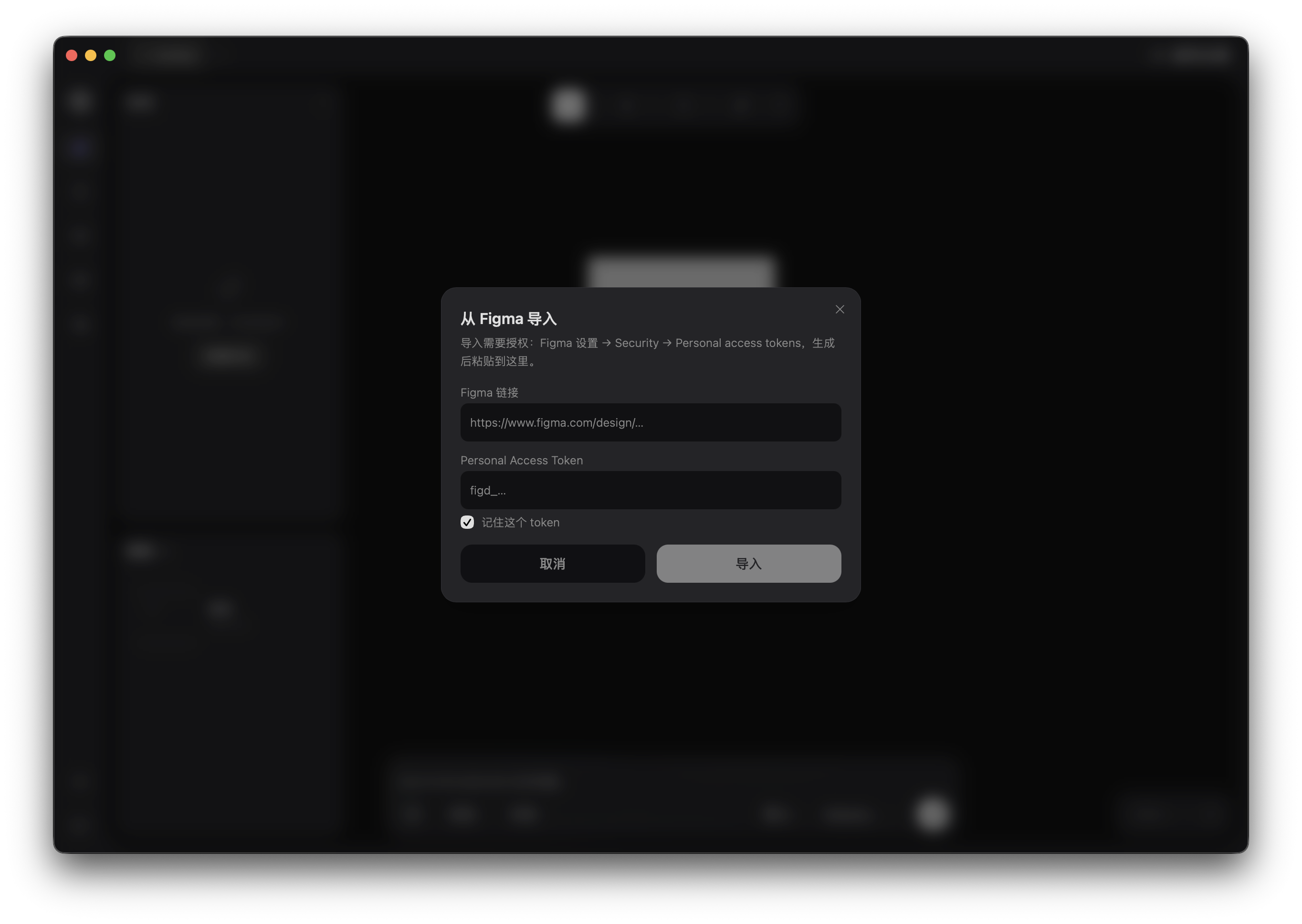
Starry can pull an existing Figma file into an editable canvas three ways: import straight from a Figma share link, open a native .fig file, or paste frames copied from Figma. This guide walks through each path and the trade-offs, using the same engine Starry uses to round-trip your designs.
Three ways to import
From a Figma link (REST). Paste a file URL and a Personal Access Token; Starry fetches the document over Figma's API and converts it into a .fig document.
Open a .fig file directly. Highest fidelity — Starry parses the native file and reuses Figma's own render cache, so vectors, text, and components land exactly.
Paste from Figma. Copy frames in Figma, paste into Starry (⌘V); Starry parses Figma's HTML clipboard payload into real layers.
Which one? Use the link import for files you don't have locally, the .fig open for maximum fidelity, and paste for quickly grabbing a few frames.
Get a Figma Personal Access Token
The link import needs a Figma Personal Access Token (PAT) so Starry can read the file over the API. A free Figma account is enough — no OAuth app or plugin required.
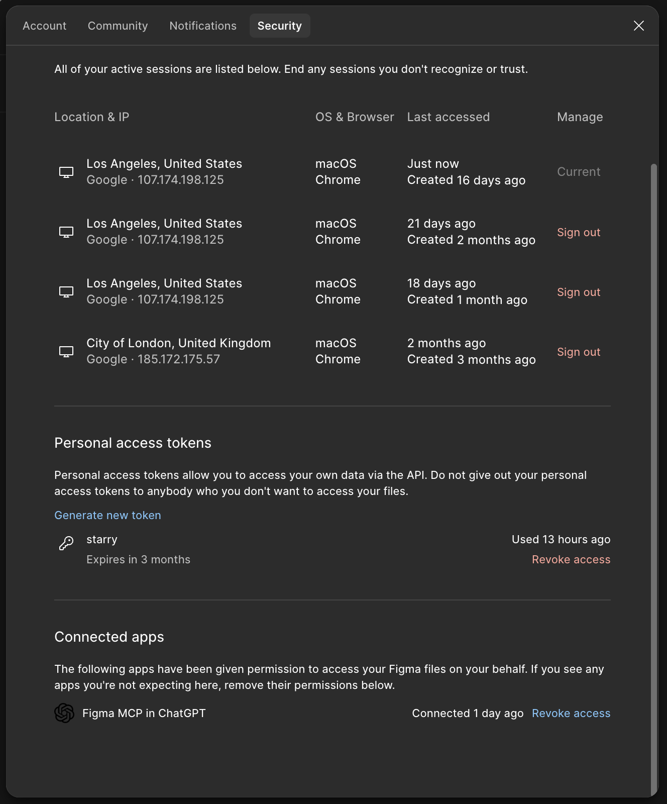
Everything starts in Figma: click your avatar (top-left) to open the account menu and choose Settings.
Open Figma and go to Settings → Security.
Under Personal access tokens, click Generate new token.
Give it a name (e.g. "Starry"), then copy the token immediately — Figma shows it only once.
Generate a token under Figma Settings → Security. Starry only needs read access to the files you point it at.
Scope. A PAT reads the files your Figma account can see. It cannot modify your files or charge anything.
Import from a Figma link
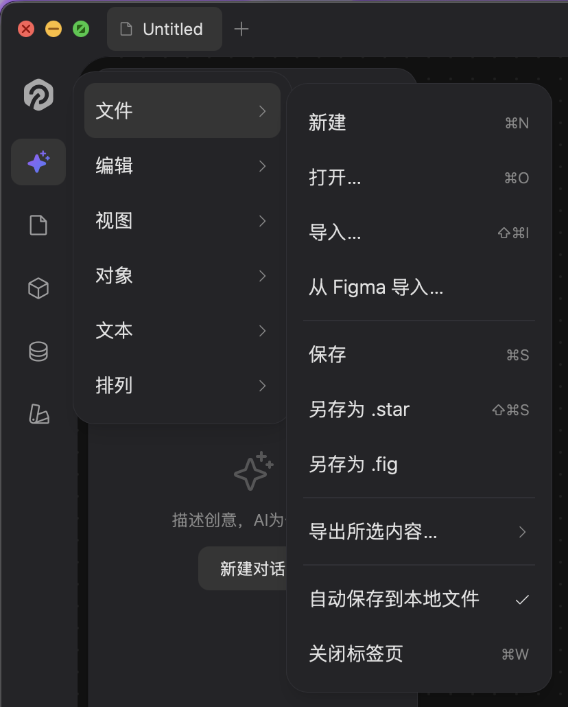
In Starry, open File → Import from Figma… (the same menu holds Open, Save, and Export).
In Starry, open the menu File → Import from Figma….
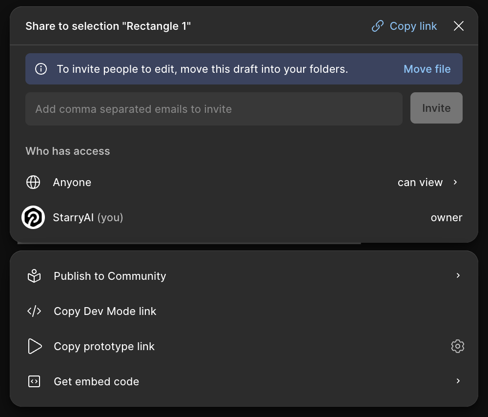
Paste the Figma file URL (the one that contains /file/<file_key>/ or /design/<file_key>/). In Figma, click Share (top-right) and choose Copy link to get it.
Figma's Share dialog — use Copy link at the top-right to grab the file URL.
Paste your Personal Access Token.
Click Import. Starry parses the file_key, fetches the document, and converts it to a .fig document on your canvas.
Paste the Figma file link and your token, tick Remember this token to skip it next time, then click Import.
Under the hood Starry calls Figma's REST API in two passes: first GET /v1/files/:key with geometry=paths and no depth limit to pull the full node tree and vector paths, then GET /v1/files/:key/images to fetch exported images — up to 200 images, fetched 6 at a time in parallel. The result is mapped onto Starry's scene graph and saved as a native .fig document you can edit and re-export.
What gets imported
Frames, sections, and pages
Text layers (including Figma's rich styling)
Components and component instances
Auto layout containers
Vector paths and boolean operations
Fills, strokes, and effects
Image fills (pulled from Figma's image endpoint)
Open a .fig file directly
Drop a .fig onto the canvas, or open it from the file browser or your OS. Starry imports it natively — no conversion step, no API token needed. Because it parses the native format and reuses Figma's render cache, this path preserves the most detail and is the best choice when you already have the file.
Paste from Figma
Select one or more frames in Figma, copy, then paste into Starry. Starry detects Figma's clipboard payload and reconstructs the nodes exactly: vectors, text, components, and styles all transfer. It works the same in reverse — copy from Starry and paste into Figma.
Known limitations
The REST (link) route may skip some gradients and flatten mixed-style runs of text.
Component links can be lost on the API route; re-link them in Starry if needed.
Image fetching is capped at 200 images per import.
Occasionally a single node can't be converted — Starry skips it and notes it rather than failing the whole import.
Want the original back? For pixel-perfect fidelity, open the native .fig directly instead of importing by link — the link route trades a little detail for not needing the local file.
Troubleshooting
A 403 from the import can mean two different things, and Starry reports them separately:
The file isn't visible to the token. Make sure the Figma account that owns the PAT can open the file (share it with that account, or use a token from an account with access).
The token was rejected. The PAT is wrong, expired, or missing the read scope. Generate a fresh one in Figma Settings → Security.
FAQ
Why not just download the .fig binary? Figma's API has no endpoint that returns the raw .fig file, and the public download is served over a WebSocket stream rather than a simple REST call. The link import therefore goes through the documented REST file/image endpoints and rebuilds an equivalent .fig inside Starry — which is also why opening a local .fig gives the highest fidelity.
Once your design lives in Starry, export it to code — JSX (Tailwind) or HTML — and your code owns the result. See Exporting code.
Code & export
CLI reference
The starryai CLI inspects, analyzes, and exports design files headlessly — no editor needed. Great for scripts and CI. Install it globally:
npm install -g @starryai/cli
Inspect documents
Browse and query .pen / .fig files without opening the editor:
tree — print the node tree.
find — find nodes by name or type.
node — show detailed properties of a node by ID.
query — query nodes using XPath selectors.
info — show document info (pages, node counts, fonts).
pages — list the pages in a document.
variables — list design variables and collections.
selection — read the current selection from the running app.
starryai tree design.fig
starryai find design.pen --type TEXT
starryai node design.fig --id 1:23
starryai info design.fig
Analyze and lint
analyze — analyze colors, typography, spacing, and repeated clusters.
lint — lint documents for consistency, structure, and accessibility issues.
formats — list supported document and export formats.
Convert and export
convert — convert a document to another writable format.
export — export to PNG, JPG, WEBP, SVG, PDF, HTML, JSX, or .fig. See Exporting code for the full options.
Script the editor
eval — execute JavaScript with the Figma Plugin API against the running app — every editor operation can be scripted.
Combine with MCP and ACP for fully programmable pipelines: lint on every commit, extract tokens, and generate code from designs automatically.
Guides
Liquid Glass effect
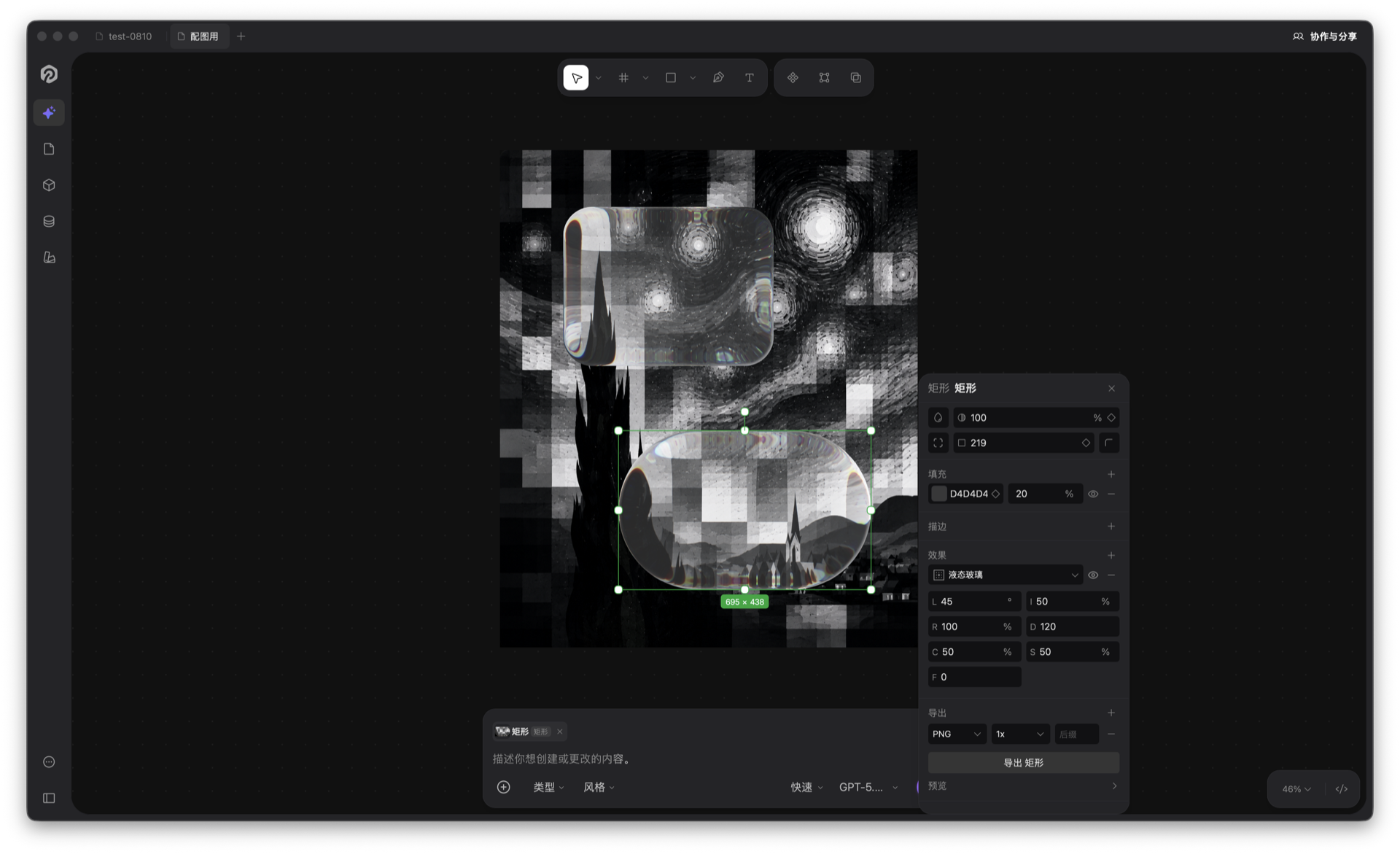
Liquid Glass is Starry's Figma-compatible glass effect: it turns any layer into a refractive, frosted glass panel with editable light, refraction, depth, dispersion, Splay, and Frost controls. The renderer matches Figma closely — rounded corners, Snell refraction, chromatic edge tinting, edge highlights, inner shadow, backlight, and saturation boost.
Liquid Glass in the Starry editor: glass shapes sit on the canvas while the inspector tunes the seven controls — light angle, intensity, refraction, depth, dispersion, splay, and frost.
Add the effect
Select a layer, then in the right-hand inspector open Effects and add a Liquid Glass effect. You can also ask the AI — "make this card liquid glass" — Starry adds it for you with the set_effects tool.
Two things happen automatically when Glass is applied:
The layer's fill drops to 20% opacity (if it was more opaque) — the glass needs to let the background through to read as glass.
Only one Glass effect per node. Adding another is blocked until you remove the first.
Tune the look
Expand the effect in the inspector to adjust the seven glass controls (defaults in parentheses):
Light angle (45°) — direction of the light that creates edge highlights.
Light intensity (50%) — how bright the highlights are.
Refraction (30%) — how strongly the background is bent through the glass.
Depth (20) — how thick the glass edge looks.
Dispersion (20%) — the chromatic red/blue tint along the edges.
Splay (50%) — how widely highlights spread out.
Frost (0) — blur radius of the background; the frosted, "matte" glass look.
Glass samples whatever is already painted behind it — a busy, colorful background makes the effect pop; on an empty white canvas there's little to refract. A translucent fill plus a thin light stroke strengthen the glass feel.
One backdrop only. Liquid Glass and Background Blur share the same backdrop — Starry renders only the first of the two, so don't stack both on the same node.
Figma round-trip
Glass effects survive .fig import and export, so glass you author in Starry opens in Figma and vice versa.
Guides
Design systems
A design system is a style spec you hand to the AI: a Markdown document describing your tokens, spacing, typography, and component rules. The active design system is injected into every generation, so the AI builds screens that follow your system instead of inventing a look each time.
Built-in presets
Starry ships with three read-only presets. The default is Minimal.
Minimal — a clean, minimal aesthetic: pure white background, a single indigo accent, 4px spacing grid, and 6/8/16 radius.
iOS HIG — Apple's Human Interface Guidelines: system colors, the SF type scale, 44pt touch targets, and continuous (squircle) corners.
Material 3 — Google's M3: the #6750A4 primary palette, Roboto type scale, 4dp grid, and elevation levels.
Switch the active system
In the chat input at the bottom of the canvas, hover the book icon to open the design-system picker and switch instantly. The active one is marked with a check and stays active across sessions.
Reference a section with @
The chat input has a fast way to point the AI at a part of your active design system. Type @ anywhere in the input and Starry opens a popover that lists the section headings of the currently active design system. Keep typing to filter the list, then pick a heading to drop @Heading straight into your message.
How the @ menu recognizes your design system
Active system only. The menu lists headings from whichever design system is currently active. Switch the active system with the book icon and the @ options change to match it.
Markdown headings #–####. Every heading from level 1 to level 4 (#, ##, ###, ####) becomes a selectable item. Plain paragraphs, lists, and deeper headings are ignored.
Case-insensitive substring match. Whatever you type after @ is matched against the heading text — so @col surfaces Colors and @typ surfaces Typography.
No active system → no sections. If nothing is selected, the menu prompts you to pick a design system first; @ can't offer headings until one is active.
Referencing a section is a shortcut, not a paste. The full active design system is already injected into the AI's instructions on every generation, so @Colors simply tells the AI "focus on the color tokens for this request" — you don't have to retype them.
Try it. With Minimal active, type Build a pricing card using @Colors and @Radius — the AI pulls those exact tokens from your system instead of guessing.
Create your own
Open the design-system manager — the Design system item in the left rail, or the gear button in the picker. From there you can:
Create — start from a blank template and write your spec in Markdown (name + body).
Edit — custom systems are fully editable, with a live preview and an explicit save; built-in presets are read-only.
Import — drop in a .md / .markdown file and it becomes a custom system.
Export — right-click any entry and download it as a .md file.
Delete — remove custom systems (with confirmation); presets can't be deleted.
Write it like the presets
Use concrete tokens, not vague adjectives, and structure the document with Markdown headings — each heading becomes an @ option the AI can target. A starter custom system looks like this:
Save it, then activate it from the book icon. From now on, typing @ in the chat offers Colors, Typography, Spacing, Radius, and Components — and every render follows these values.
How it takes effect. When you generate, Starry injects the active system into the AI's instructions ("apply these tokens, spacing, typography and component rules to every render"), and the built-in verify_design check also flags design-system violations — so the result stays on-system.
Guides
The chat input
The chat input sits at the bottom of the canvas. It's where you describe what you want — and far more than a plain text box. You can reference design-system sections, call canvas tools by name, attach files and selections, set a style or deliverable intent, and recall past prompts. This guide walks through every control.
The chat input at the bottom of the canvas: type a prompt, choose a model, and send.
Type and send
Type your request in natural language and press Enter to send. Shift+Enter inserts a line break without sending.
Composition-safe. If you're using a Chinese, Japanese, or Korean input method, pressing Enter to confirm a candidate never sends the message by accident — Starry swallows the composing Enter and only sends on a real commit.
Per-tab drafts. Each document tab keeps its own unsent draft. Switch tabs and your text is saved and restored; close a tab and the draft clears. This matches the "new tab starts empty" expectation.
Empty input won't send. The send button stays disabled until there's text or an attachment, so you never fire a blank request.
Reference a design system with @
Type @ to open a menu of the active design system's sections. Starry reads the headings (#–####) in that system's Markdown and lists them; keep typing to filter by a case-insensitive substring, then pick one to insert @Colors, @Typography, and so on.
This is a shortcut, not a paste: the whole active system is already injected into every generation. @Colors just focuses this one request on your color tokens. Switch the active system from the book icon and the menu's options change with it. For the full picture — presets, creating your own, and import/export — see Design systems.
Call a tool with /
Type / to open a tool palette. Starry lists its 100+ canvas tools — the very same operations the built-in verify_design checks use and that MCP / ACP agents call. Start typing to filter, then pick to insert /render, /set_fill, /get_selection, and so on.
Use it when you want the AI to apply a specific operation instead of deciding one itself. A few you'll reach for often:
/get_selection — read the currently selected element.
/render — draw a new design element from a spec.
/set_fill, /set_stroke, /set_radius — restyle a node.
/update_node, /reparent_node — change properties or move a node.
/stock_photo — search for a stock image to place.
The tool name is a hint to the model; Starry still resolves it against what's actually on the canvas, so it won't invent tools that don't exist.
Add context with +
Click the + button to attach context without typing a word:
Selection / canvas resource — pull in the element you have selected, or any node, layer, or page.
Import document — drop in a Word, PDF, Markdown, or text file; its content becomes an inline reference chip.
Import photos — add images as resource chips the AI can read.
Selected elements also appear automatically as a chip above the input, with a thumbnail and a type label (e.g. "Rectangle"), so the AI always knows what you're pointing at. You can dismiss it with the ×. Prefer dragging? Drop image or document files straight onto the input — they go through the same path.
Resources are referenced, not pasted. Attached files and selections are sent as structured context (and as pixels on multimodal models), not dumped as raw text — so your prompt stays clean and the AI still "sees" them.
Set a style and a deliverable
Two chips sit above the input: Style and Deliverable. Pick a preset from either to steer the look (e.g. "Glassmorphism") or the output type (e.g. "Landing page") for this message only — they don't change your design system and clear after sending. They're a quick way to bias a single generation without rewriting the prompt.
Recall history
With an empty input, press ↑ to open your recent prompts. Navigate with ↑/↓, press Enter to drop one back into the box, or Esc to close. Every sent message is recorded, so you can resend or tweak a previous request in a keystroke.
Pick thinking mode and model
On the right of the input:
Thinking mode — Deep thinking for harder reasoning, or Fast mode for quick edits.
Model menu — choose any configured model, or an ACP agent (Claude Code, Codex, Gemini CLI) which appears under "Your agents". Manage keys and providers in Model management; connect agents via ACP & agents or MCP.
Send and stop
The round button sends. In normal mode it's green; in an agent session it turns into a purple-to-blue gradient with a sparkle. While Starry is generating, the same button becomes a Stop square — click it to halt the stream. The ⋮ menu (when shown) also offers copy-log and clear-conversation.
One box, whole workflow. Between @ for system tokens, / for tools, + for context, and the style/deliverable chips, the chat input is the single place where natural language meets precise control.
Guides
Components library
The components library is where a document's reusable components live. It runs on a real library model: one document can hold several libraries, each grouping its components into optional groups — and a component set is no longer a library of its own, only one component's set of variants. Open it from the Components item in the left rail.
Two tracks.Organizing the library is for setting libraries up and filing components into them. Working with components is for browsing the panel and placing instances on the canvas. Read whichever one you need.
The library model
Components are organized in four levels:
Library — a document-level container for related components, such as Base UI or Checkout.
Group — an optional folder inside a library. Groups are metadata only; they never create layers on the canvas.
Component — the instanced master definition.
Component set — the container for one component's variants, such as Size × State on a Button.
A component belongs to one library and at most one group at a time. Moving it never changes its component ID, so existing instances and overrides keep working.
Component set ≠ library. Earlier builds counted every component set as a library. A set now represents only the variants of a single component, while libraries are a separate, document-level concept.
Organizing the library
This track works in the top half of the panel — the library list — and decides how components are grouped. It changes only how the panel is organized: no component, no instance and no canvas layer is touched.
Create and manage libraries
Create — click + in the library header. The new library starts as an untitled library and drops straight into rename mode.
Rename — double-click a library row, or pick Rename from its context menu.
Delete — right-click a library and choose Delete.
Each row shows the library name and how many components it holds. Deleting a library removes the library and its groups — it never deletes components or instances. Those components simply fall back to Unassigned, and the whole action can be undone.
Create variants
A variant is made by combining components — there is no separate "add variant" button. The workflow is:
Build one component per variant. Select the layers of a state or size and turn them into a component (⌘⌥K).
Encode the values in the name, separated by / — for example Button/Primary/Large and Button/Primary/Small. Everything after each slash becomes the value of one property, in order; the segment before the first slash is discarded.
Select two or more components and press ⌘⇧K — or pick Create component set from the right-click menu. Starry wraps them in a component set and derives the variant properties.
The derived properties follow the slash order: the first is named Variant, then Property 2, Property 3… Each component's name is rewritten to its values (Primary, Large), the distinct values become that property's options, and the first option becomes the default. Rename any property later from the pencil button in the component set's details.
The names are what create the variants. If the selected components carry no slash — or a different number of them — the components are still wrapped into a set, but no variant properties are derived, and there is no manual "add property" control to fall back on. Name them first, then combine.
Two other routes land on the same structure: importing a .fig whose components are named Size=Large, State=Hover, and asking the AI for a component set — code it generates is read the same way.
Groups inside a library
With a library selected, click + in the component header to add a group. Groups only organize the panel — they are never drawn on the canvas. From a component's context menu, Move to → library → group files it in; deleting a group sends its components back to the library root rather than out of the library.
Unassigned
Unassigned is a built-in view, not a library you can delete. It collects every component that has not been filed into a library yet — including components carried over from documents created before libraries existed. The counter beside it shows how many are still waiting to be organized.
Move, rename and remove
Right-click any component, variant or group for the same set of actions: Move to (Unassigned, any library, or a group inside it), Rename, and Delete. Deleting a master detaches the instances already on the canvas and keeps their visible content, so nothing disappears from your design.
Working with components
This track works in the bottom half of the panel — the component list — and on the canvas, once an instance has been placed.
Open the panel
The panel is split in two — the library list on top, the component list below. Drag the divider to resize the split, and pin the panel from its header to keep it open while you work on the canvas. It follows the same interaction model as the Variables panel.
Browse and search
Live thumbnails. Every row renders the component on the fly, at 2× resolution so it stays crisp on high-DPI displays.
Variant summary. Component sets show their variant count, and a conflict warning appears on the row when two variants share the same property values.
Groups as folders. Group rows behave like folders — click one to drill into its components, then use the back arrow in the header to return.
Search. Filtering matches the component name, its description, the library it belongs to, and its variant property values.
Preview and insert
Clicking a plain component inserts it right away; clicking a component set or a group opens its details so you can pick the exact variant. There are three ways to place an instance:
Click the + button on the row,
double-click a component set row, or
drag a row onto the canvas — the thumbnail follows your cursor and the instance drops where you release it.
Instances land at the center of the viewport, or inside the container you have entered, and stay linked to their main component: edit the master, and every instance updates.
Variants and properties
A component set's details list every variant as its own row — click one, or drag it out, to insert exactly that variant. Below them, each variant property is shown with its possible values (for example Size: Small, Large) and can be renamed from the pencil button. Duplicated property combinations are flagged as a conflict on the component row, so you can fix them before shipping.
Switch variants
Select an instance on the canvas and the inspector shows a Variants section — one dropdown per variant property, each listing that property's values. Picking a value swaps the instance to the matching variant. If that exact combination does not exist, Starry falls back to the closest one it has, the variant that differs in the fewest properties.
FAQ
Is a component set a library?
No. A component set groups the variants of one component; a library groups many components together.
What happens to the components in a library I delete?
They are kept. Deleting a library only removes the library and its groups — the components move to Unassigned and keep both their master definitions and their instances.
Where are the components from my older files?
They land in Unassigned the first time the document is opened, so nothing is silently reorganized into a library you did not create.
Can I share a library between files?
Not yet — libraries are document-level. Publishing, subscribing and cross-file updates are not part of this release.
Guides
Variables library
Variables are named values you can bind to properties — colors, numbers, text, and booleans. Bind a fill to a color variable and change it in one place to update the whole design. Open the library from the Variables item in the left rail.
Variable types
Four types, each with its own icon:
Color — palette swatch, for fills, strokes, and more.
Number — for spacing, radii, sizes, opacity…
Text — strings, e.g. a brand name or label.
Boolean — toggles, e.g. show/hide an element.
Collections and modes
The top half of the panel lists your variable collections (also called tables). Add one with the +, rename it by double-clicking or from the context menu, delete it from the context menu. If you have no collections yet, the panel offers to create one.
Each collection is shown as a table — one column per mode. Modes let the same variables hold different values per context, e.g. Light and Dark. Add a mode with the + in the header, rename by double-clicking, remove any mode except the first.
Add and remove variables
Click Create variable at the bottom and pick a type. Each row is a variable; set its value per mode in the cells. Hover a row to reveal the × to delete it. Column widths are draggable.
One source of truth. Bind properties to variables and switching modes (light ↔ dark) or editing a value updates every place that uses it — no more hunting for hard-coded colors.
Integrations
MCP & editor tools
Starry ships an MCP server so any AI coding tool can inspect, modify, and export your designs headlessly. 100+ tools, the same ones the built-in chat uses.
Connect your editor
Install the server, then point your client at it. Works with Claude Code, Cursor, Windsurf, Codex, and any MCP-capable tool.
For scripts and CI, run the HTTP server instead — it listens at http://localhost:3100/mcp.
Coding agents in the chat
Run Claude Code, Codex, or Gemini CLI right inside Starry's chat panel. They connect over MCP and use the same 100+ tools. ACP and external MCP clients can run at once; Starry serializes document writes so concurrent agents don't overwrite each other. These in-chat agents are powered by ACP — see ACP & agents.
The MCP server is optional. Starry is fully usable on its own; MCP just closes the loop with your codebase.
Integrations
ACP & agents
Starry can host a local AI coding agent — Claude Code, Codex, or Gemini CLI — and let it draw straight onto the canvas. This is powered by the Agent Client Protocol (ACP): Starry launches the agent as a subprocess and feeds it Starry's canvas tools over MCP, so the agent builds and edits real, editable layers instead of handing you code to paste.
What ACP is
ACP (Agent Client Protocol) is the transport Starry uses to connect a local coding agent. Starry spawns the agent's CLI, injects an authenticated starryai MCP server as its tool source, and streams the whole conversation through the chat panel. The agent uses the same 100+ canvas tools the built-in chat uses — render, create_shape, set_fill, set_layout, find_nodes, get_page_tree, export_image and more.
ACP vs MCP. MCP lets an external client (your editor) call Starry. ACP lets Starry call an agent and give that agent the canvas. They can run at the same time; Starry serializes document writes so concurrent agents don't overwrite each other.
Requirements
Desktop app. ACP spawns a local process, so it only works in the desktop app — in the browser, ACP agents stay hidden.
Node.js with npm. All three agents are installed as global npm packages, so you need a working Node.js/npm environment (any recent LTS is fine).
The agent CLI must be installed. Starry probes each command with <command> --version and only shows agents it can actually launch.
No API key in Starry. The agent brings its own authentication — you sign in to the agent CLI itself, using your existing subscription or account. Starry only supplies the canvas MCP server, so you never paste a provider key for ACP like you do for the direct AI providers.
Install an agent
Pick one agent, install it in a terminal, verify it, and sign in. The install commands are npm global installs and work the same on macOS, Windows, and Linux.
Claude Code
npm i -g @agentclientprotocol/claude-agent-acp
claude-agent-acp --version
Sign in with your Claude subscription or API key, exactly as you would for Claude Code.
Codex
npm i -g @zed-industries/codex-acp
codex-acp --version
Sign in with your OpenAI account (ChatGPT or an API key), exactly as you would for Codex.
Gemini CLI
npm i -g @google/gemini-cli
gemini --version
Sign in with your Google account when gemini prompts you to.
If the terminal says the command is not found right after installing, your npm global bin directory may not be on PATH yet — open a new terminal window, or add the directory to PATH, then verify again.
Connect it in Starry
Open Settings → ACP (or the ACP tab in the Connections panel). Installed agents appear with an "Installed" badge; if none show up, click Refresh status — Starry re-probes your PATH. From there it's three steps:
Install an agent — pick one in the dropdown and run its install command in your terminal.
Use it as a model — open the model menu in the AI input at the bottom of the canvas and choose the agent under "Your agents".
Let it edit the canvas — just chat. The agent calls Starry's canvas tools to create and modify elements.
How a turn works
When you send a prompt, Starry opens an ACP session, launches the agent, and hands it a design-context system prompt: you're inside Starry, use the starryai MCP tools to draw on the live canvas, render JSX, and never write HTML files or run terminal commands. The agent calls canvas tools; Starry applies the changes to the live canvas as real, editable nodes.
Turns run one at a time. If you start a new request while one is still going, Starry asks whether to queue it behind the current one or replace it.
Permissions
Before certain tool calls the agent asks for permission; Starry shows a dialog you approve or reject. Unanswered requests auto-reject after 60 seconds. You choose how much to confirm in Settings → ACP:
Always ask — every step needs your confirmation.
Canvas actions auto-approved (default) — drawing and editing the canvas runs without prompts; file and terminal access still asks.
Fully auto-approved — everything runs without asking.
You can also trust Starry's canvas tools for the current project, so repeated canvas actions never prompt again. Trust is stored per agent and per project.
Troubleshooting
"No local agents detected." Run the install command for the agent you chose, then click Refresh status in Settings → ACP.
Codex ACP can't read its model cache. It's out of date — update it with npm i -g @zed-industries/codex-acp@latest, then restart Starry.
"AI agent error, please retry." That's an ACP protocol-level error (a handler threw). Check the agent's own CLI for auth or quota issues and retry.
ACP agents and external MCP clients can run together; Starry serializes document writes.
Behind the scenes the flow is: browser ↔ WebSocket ↔ Starry's MCP server ↔ HTTP ↔ the agent subprocess.
Integrations
Local-first & collaboration
Starry is local-first: your work stays on your machine by default and plays nicely with Git and the tools you already use.
Files on your machine
Every project is a plain .pen file — commit it, branch it, review it like code. The .pen format is Kiwi binary + Zstd + ZIP: open, not proprietary.
Real-time collaboration
Share a link to co-edit live. Peers connect directly over WebRTC — no server, no account. You see each other's cursors, selections, and presence; click an avatar to follow their viewport.
Components & auto-layout
Build reusable components and component sets, and lay everything out with flex or CSS-grid auto-layout via Yoga WASM. Variants switch from the inspector.
You stay in control of the source. Starry never claims ownership of your designs or the code it exports.
Settings
Model management
Starry is model-agnostic: pick any provider, add your own API key, and start designing. The model list shows every model you've configured and lets you add, edit, or remove them. Open Settings → Models.
Supported providers
Starry ships with 20 providers out of the box. Each provider has a "get API key" link, a default model, and a preset model list.
Global hubs — OpenRouter: one key unlocks 100+ models from many providers.
Direct providers — Anthropic (Claude), OpenAI (GPT), Google AI (Gemini), DeepSeek, Z.ai (GLM), MiniMax.
More global providers — xAI (Grok), Mistral, Cohere, Perplexity.
Bring your own endpoint — OpenAI-compatible, Anthropic-compatible, or a fully custom provider with any base URL and model ID.
Add a model
Click Add model in Settings → Models. A configuration dialog opens: pick the provider, then fill in:
API key — paste the key for that provider (a link to the provider's key page is right there).
Model ID — choose from the provider's preset list, or type a custom one.
Model name (optional) — a friendly display name; leave empty and the list shows "model ID · provider".
Base URL — only for compatible/custom providers, e.g. http://localhost:11434/v1 for a local endpoint.
Protocol & API type — OpenAI/Anthropic-compatible, plus Completions vs Responses for OpenAI-style APIs.
Use Test connection to verify the endpoint and Multimodal test to detect whether the model accepts images. Models without a key are marked "Not configured" in the list.
Edit and remove
Click any model row to edit its configuration. Hover a row to reveal the remove (×) button — removal only appears when you have more than one model.
Switch models
Pick the active model from the model menu in the chat input at the bottom of the canvas. ACP agents (Claude Code, Codex, Gemini CLI) show up under "Your agents" there, not in the model list — see ACP & agents.
Tip: with OpenRouter, one key unlocks models from every provider — great for comparing Claude, GPT, Gemini, DeepSeek, Qwen and more without switching keys.
Settings
Stock photo keys
Starry can fill shapes with real stock photos when the AI generates an interface. This is optional — without keys, Starry uses placeholder colors — but with a free key the result looks like a finished design instead of a wireframe.
Add keys
Open Settings → Stock photo. Two optional keys are supported and saved automatically as you type:
When generating a screen, Starry's stock_photo tool places real Pexels images onto leaf shapes (Rectangle/Ellipse) — a hero image, a card thumbnail, a portrait avatar. All photos are fetched in one batched call, and you can hint the orientation: landscape (default), portrait, or square.
If a key is missing or returns 401, Starry tells you to add or check it in Settings → Stock photo — it doesn't silently fall back to hand-drawn gradients.
Tutorials
Get an OpenRouter API key
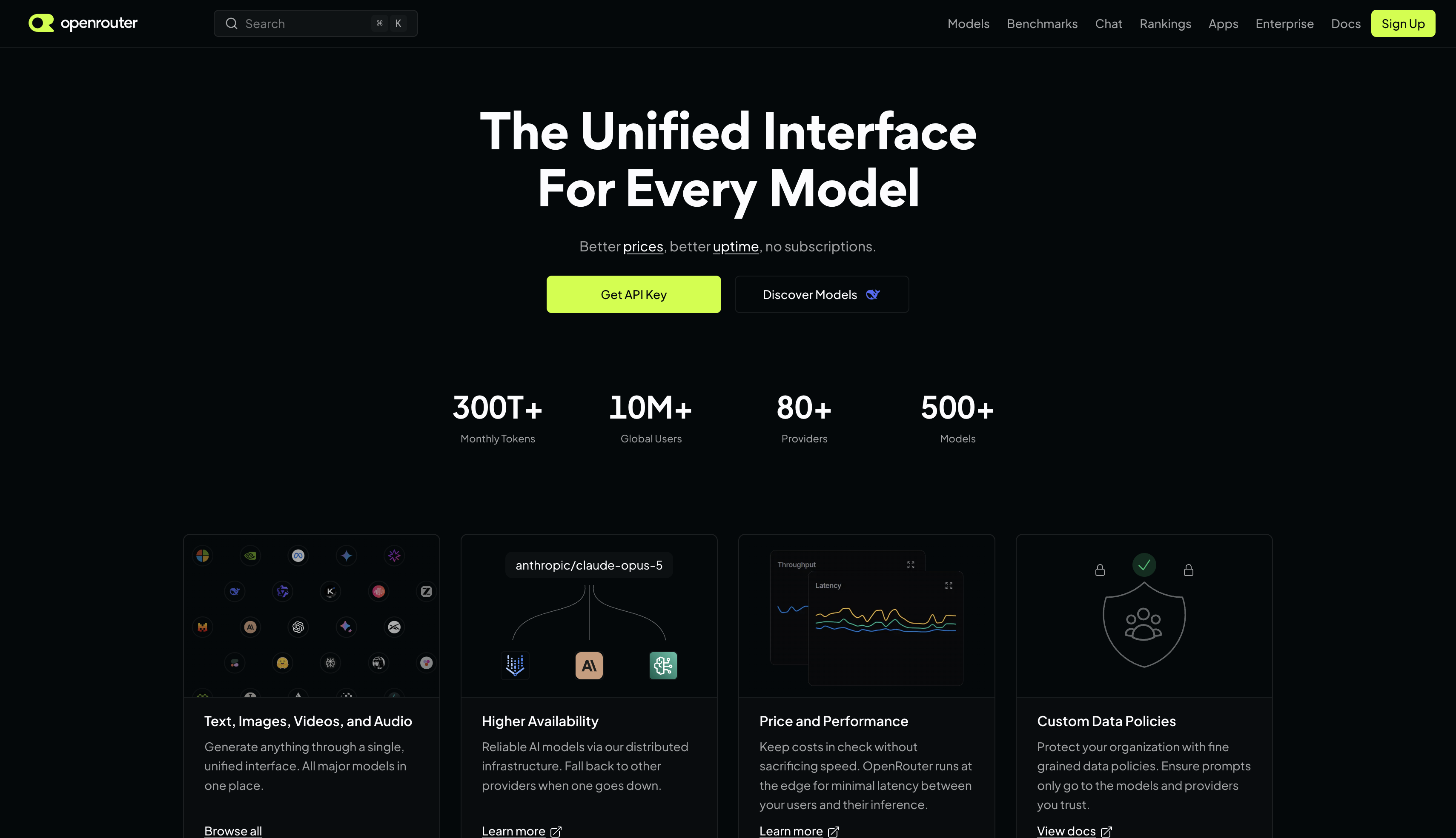
OpenRouter is an AI model gateway: a single account and a single API key give you access to 100+ models — Claude, GPT, Gemini, DeepSeek, Qwen, Kimi, and more — through one OpenAI-compatible endpoint. Instead of signing up with every provider separately, you top up one balance and switch models by changing a model ID.
Starry is model-agnostic and treats OpenRouter as a first-class provider. Add your OpenRouter key once, and the AI that builds and edits your UI can call any model OpenRouter hosts. This guide walks you through the whole setup in a few minutes.
OpenRouter homepage: one account and one key give you access to 100+ models.
What is OpenRouter?
OpenRouter aggregates models from Anthropic, OpenAI, Google, DeepSeek, Qwen, Z.ai, MiniMax, and many others behind one API. You get unified billing, a shared balance across all models, and a transparent markup shown on each model page. For an AI design tool like Starry — where you want to compare how different models render the same screen — one key is the fastest way to try them all.
Step 1 — Create an account
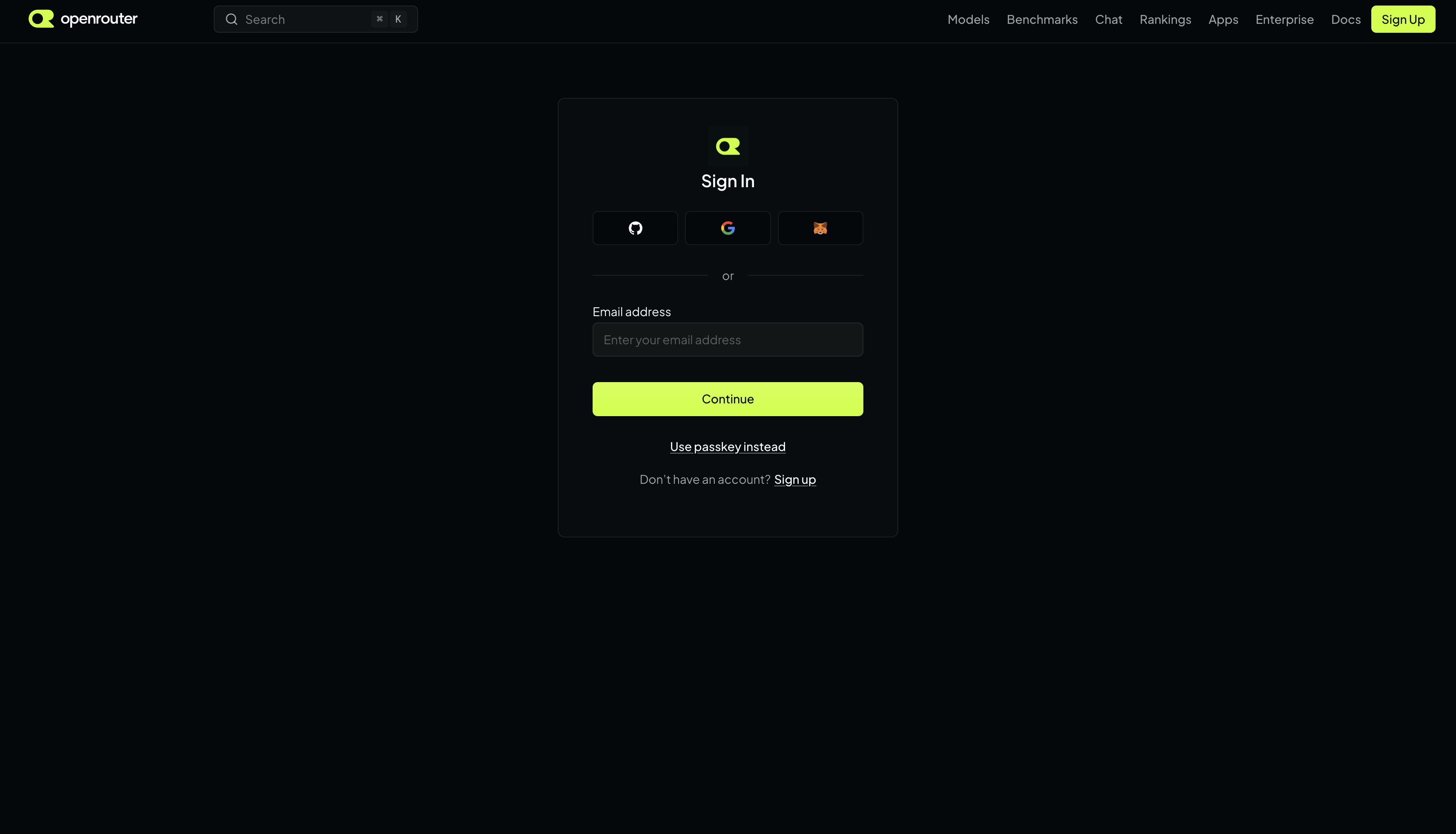
Go to openrouter.ai and click Sign in in the top-right corner.
Sign up with Google, GitHub, Discord, or an email address. No credit card is required to create an account.
If you used email, check your inbox for the verification link and confirm it.
The OpenRouter sign-in page: choose Google, GitHub, Discord, or email.
Step 2 — Create an API key
After signing in, open openrouter.ai/keys (or click your avatar → Keys).
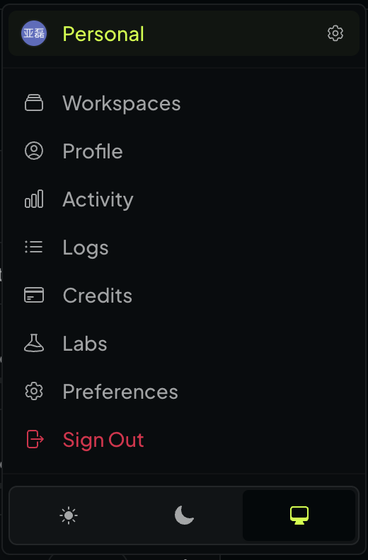
Click your avatar to open the account menu, then choose Keys or Credits.
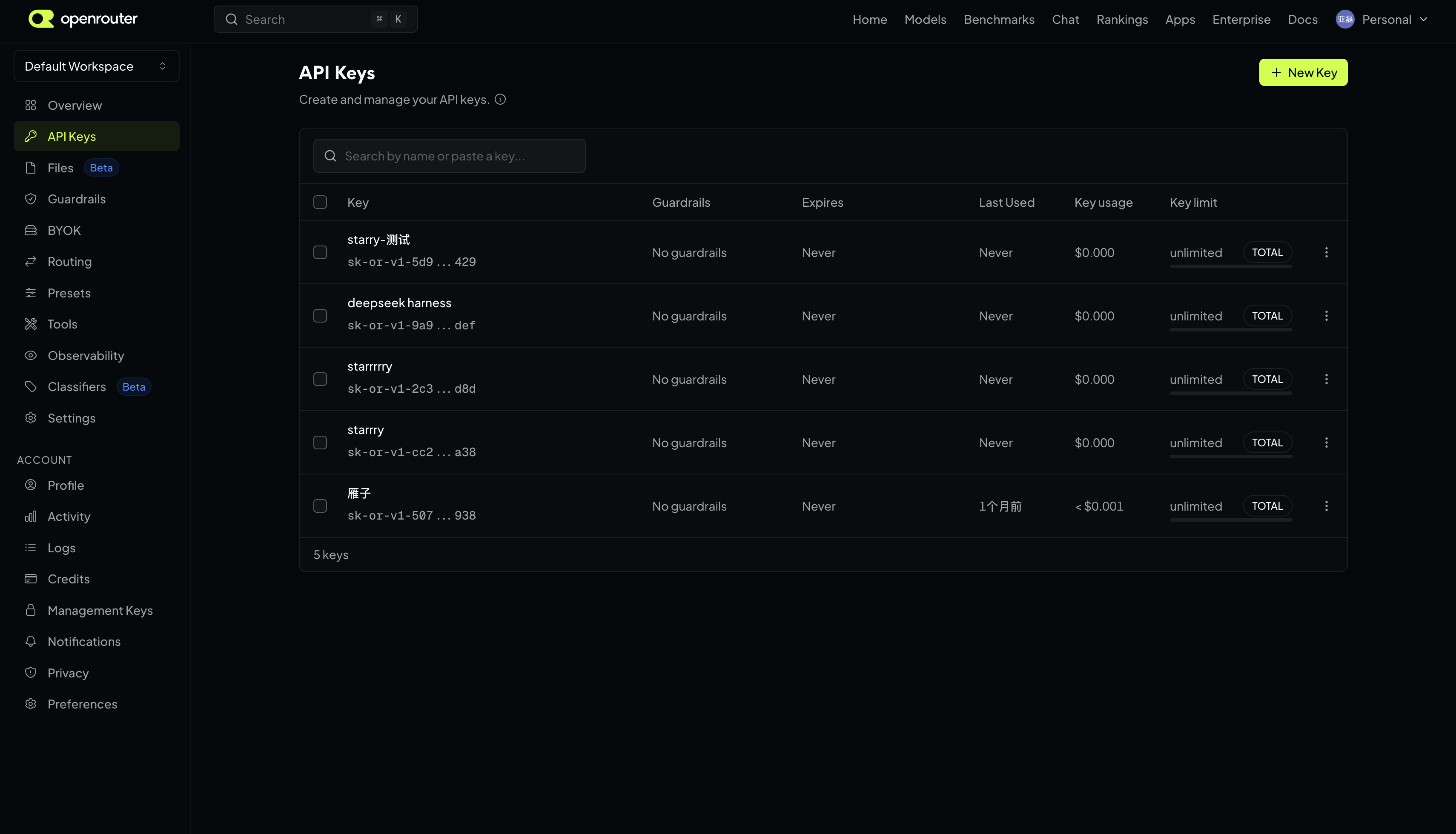
Click Create key.
Give the key a name (for example starry), and optionally set a credit limit so a single key can never spend more than you allow.
Click Create and copy the key — it starts with sk-or-v1-.
The full key is shown only once. Copy and save it somewhere safe right away; if you lose it, you create a new one.
The API Keys page: click New Key, name it, and copy the value starting with sk-or-v1-.
Step 3 — Add credits (optional)
OpenRouter uses a prepaid balance. You only need to add credits if you want to use paid models; free models work without any balance. To top up, open the Credits page and click Add credits. OpenRouter accepts credit cards and crypto, with the exact payment options shown in your dashboard.
Because one balance is shared across every model, you never manage separate billing for Claude, GPT, or Gemini — a single top-up covers them all.
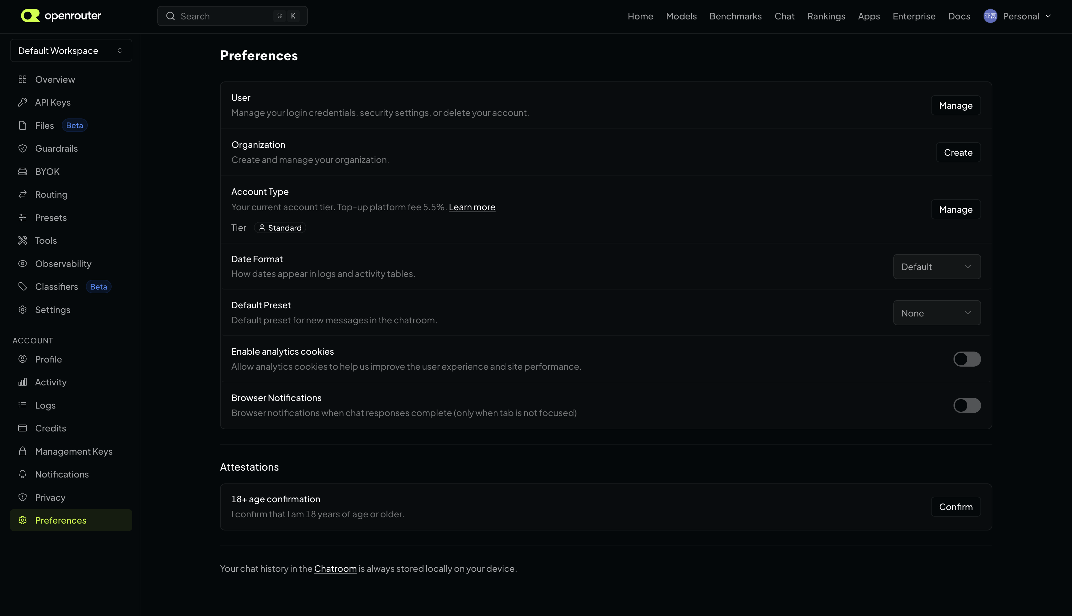
The account settings page shows your current tier and top-up details.
Try free models first
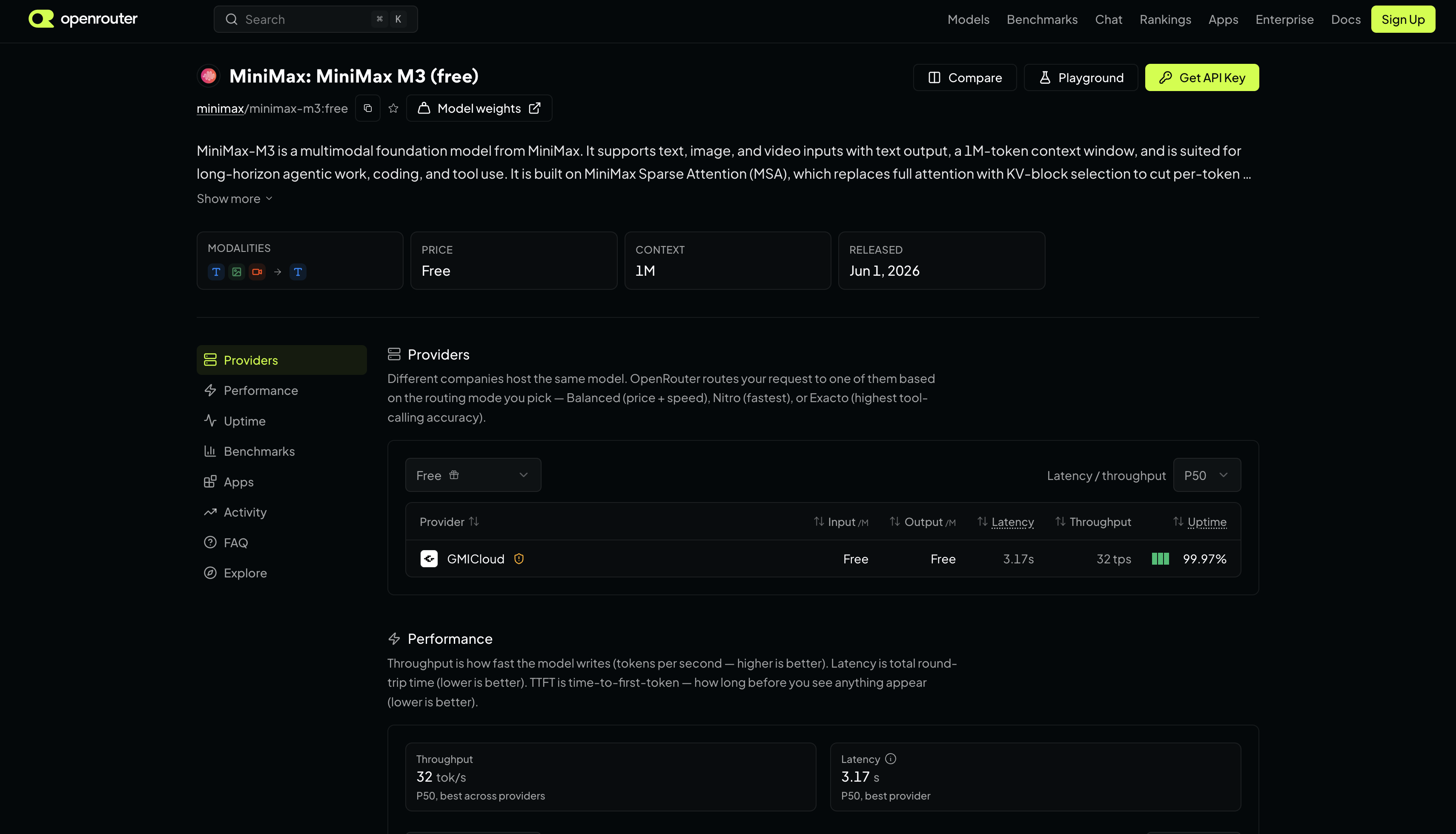
OpenRouter lists free models with a :free suffix (for example deepseek/deepseek-chat:free). They cost nothing but are rate-limited with a daily request cap, so they are ideal for testing. Adding a small amount of credits lifts the free-tier daily limit — check the current free list for the latest models and limits.
Models marked with :free cost nothing and are perfect for testing.
OpenRouter is free to sign up for, and it offers free models marked with a :free suffix that are rate-limited. Paid models are billed per token through prepaid credits.
Do I need a credit card to get an OpenRouter API key?
No. You can create an account and generate an API key without a credit card. You only add credits when you want to use paid models; free models work without any payment.
What does an OpenRouter API key look like?
An OpenRouter API key starts with sk-or-v1-. The full key is shown only once when you create it, so copy and save it immediately.
Can I use one OpenRouter key for every model?
Yes. One OpenRouter key unlocks 100+ models from Anthropic, OpenAI, Google, DeepSeek, Qwen, and more, all through a single OpenAI-compatible API.
How do I connect OpenRouter to Starry?
In Starry, open Settings → Models, pick OpenRouter as the provider, and paste your key. Starry then uses OpenRouter to power the AI that generates and edits UI on the canvas.
Asset management
Asset Library
The Asset Library (new in v0.17+) connects your local images, icons, fonts, and design source files directly into the editor. Previously these assets could only be brought in by downloading and re-uploading or copy-pasting onto the canvas; the Asset Library "mounts" them into Starry so they become searchable, reusable resources in the left-hand panel.
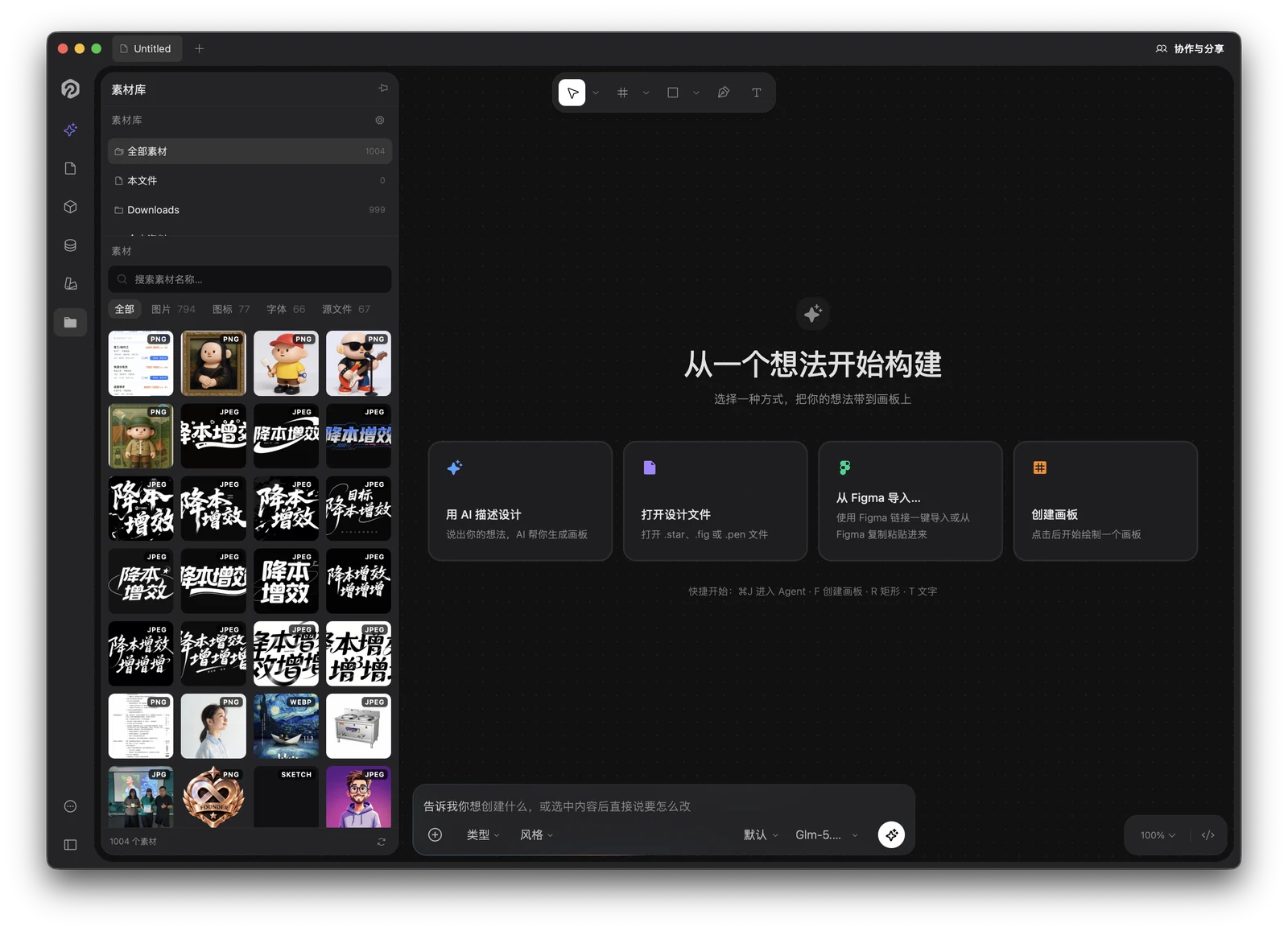
The Asset Library panel on the left: 1,004 assets from two mounted folders, filterable by Images / Icons / Fonts / Sources.
What is the Asset Library
During design you always end up with a pile of assets scattered on local disk — product screenshots, illustration SVGs, brand fonts, Figma/PSD files someone sent over. The Asset Library "mounts" those resources into Starry, turning them into a panel you can search and reuse at any time.
Assets appear in two ways:
Current canvas.Images already placed in the current document automatically appear under the "Current canvas" group, with no configuration needed.
Local folders.Directories you mount on purpose are recursively scanned for images, icons, fonts, and source files, then persisted so they are re-scanned automatically on next launch.
How to open it
In the left toolbar (alongside Document / Components / Variables / Design System) click the Asset Library icon and the panel slides out from the left. The panel can be pinned to stay open without blocking canvas work.
Desktop only.The Asset Library relies on local file-system access and is available only in the Starry desktop app (macOS / Windows). On the Web, clicking it shows "Local folder mounting is not supported in this environment."
Two views: asset sources
Switch at the top of the panel:
Current canvas — images already placed in the current document (doc:// embedded assets), live-updating with canvas content.
All — current-canvas assets merged with every mounted folder's assets.
Specific folder — shows only assets under one mounted local directory.
Supported asset formats
Raster images — png jpg jpeg webp gif bmp ico tiff tif avif heic heif: click or drag to insert as an image node.
Vector icons — svg: pasted as an editable vector (not a raster).
Fonts — ttf otf woff woff2 eot dfont ttc: after registration they appear in the text tool's font list.
Design source files — fig star sketch xd psd ai afdesign afphoto afpub pen: collected and shown as "source files" for centralized management (not inserted directly as images).
Source switch: Current canvas / All / specific folder.
Hovering any asset shows its type, containing folder, and dimensions, and auto-derives tags from the path and file name.
Image previews: pick an asset and it lands on the canvas at the viewport center, selected — the right-hand panel shows its name, dimensions, format, auto-derived tags and source path.
Insert into the canvas
Click an asset to insert an image node at the viewport center.
Drag onto the canvas to drop it at any position (via the application/x-starry-asset drag channel).
Fill a selected shape — select a fillable shape (rectangle / ellipse / star / vector / boolean result), then "Fill"; the image fills the shape with FILL scaling.
Dragging an asset onto the canvas — the thumbnail follows your cursor and the image lands exactly where you drop it.
SVG special handling
SVG assets are inserted through the pasteSvg path as editable vector nodes (not rasterized bitmaps), so you can keep editing paths, strokes, and fills.
Font registration
Font assets offer a "Register" action: after registering, the font is written into Starry's font list and selectable from the text tool without installing it through the system. Registered font paths are recorded and restored automatically on restart.
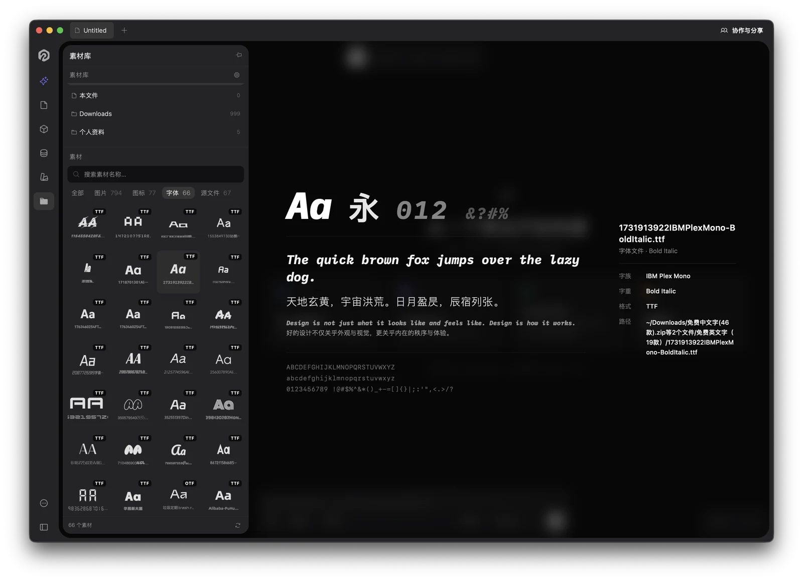
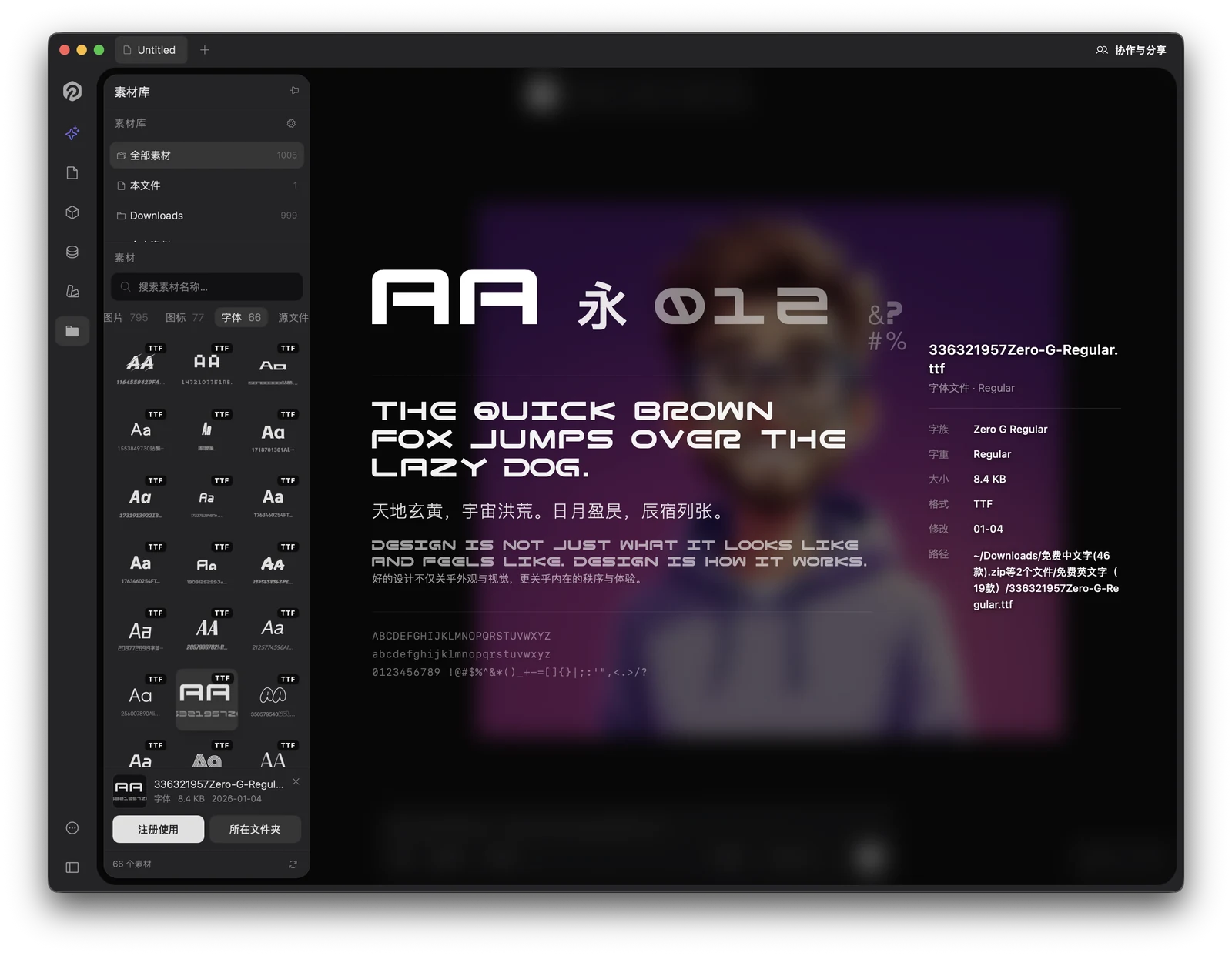
Font previews: filter to Fonts to browse every typeface as an "Aa" tile — selecting one renders a live specimen (Aa 永 012 &? #%), with name, weight, format and path alongside.Font registration: with a font selected, the bottom action bar offers Register — one click makes it selectable in Starry's text tool, no system install. Reveal in Folder opens its location on disk. Here Zero G Regular, read straight from a local .ttf.
Reveal in Finder
Assets from local folders support one-click "Reveal in Finder" to open their containing directory directly.
Managing local folders
Add a folder in the Assets tab of the settings dialog, using the system directory picker. Starry recursively scans sub-directories and collects all supported assets.
Persistence the mounted folder list is saved and re-scanned automatically on next launch — no need to re-add.
Remove a folder removes its assets from the panel immediately and clears the preview cache.
Permissions.Sub-directories without read permission are skipped silently (a debug-log hint in the console) and do not interrupt the overall scan.
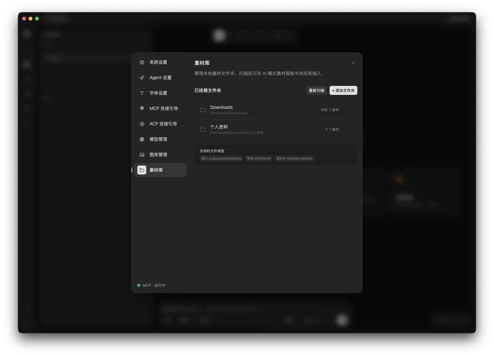
Settings → Asset Library: mounted folders, re-scan, add folder, and the supported file types — all in one place.
FAQ
Can I use the Asset Library on the Web?
No. Local folder mounting depends on the desktop file-system API. On the Web you can only view "Current canvas" embedded assets; mounting and font registration are unavailable.
I mounted a folder but assets don't show up?
Confirm the directory actually contains supported formats (see "Supported asset formats").
Confirm Starry has read permission for that directory (sub-directories limited by system privacy settings are skipped).
If files are added after mounting, re-trigger the scan in settings.
Can Figma / PSD source files become designs directly?
For now the Asset Library collects them as source files for centralized storage and locating; what gets inserted by click is image-class assets (png/jpg/webp/svg, etc.). Parsing and converting design files belongs to a separate capability.
Is font registration safe?
Registering only reads the font file into Starry's font list for use by this app; it does not modify the system font directory.